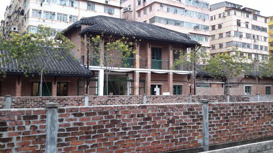
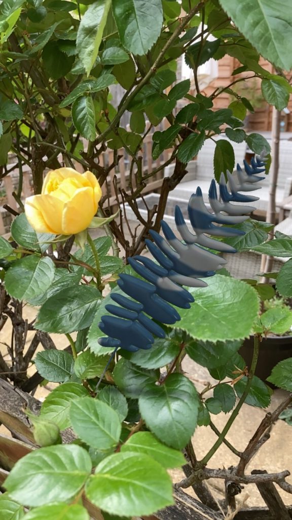
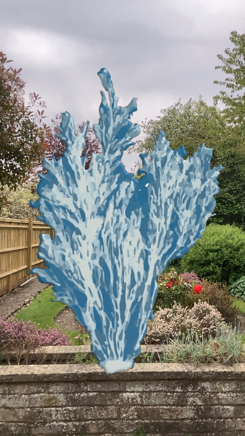
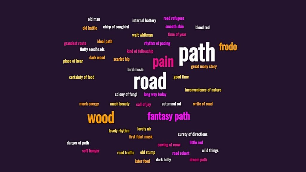
more studies in chopping the tabla
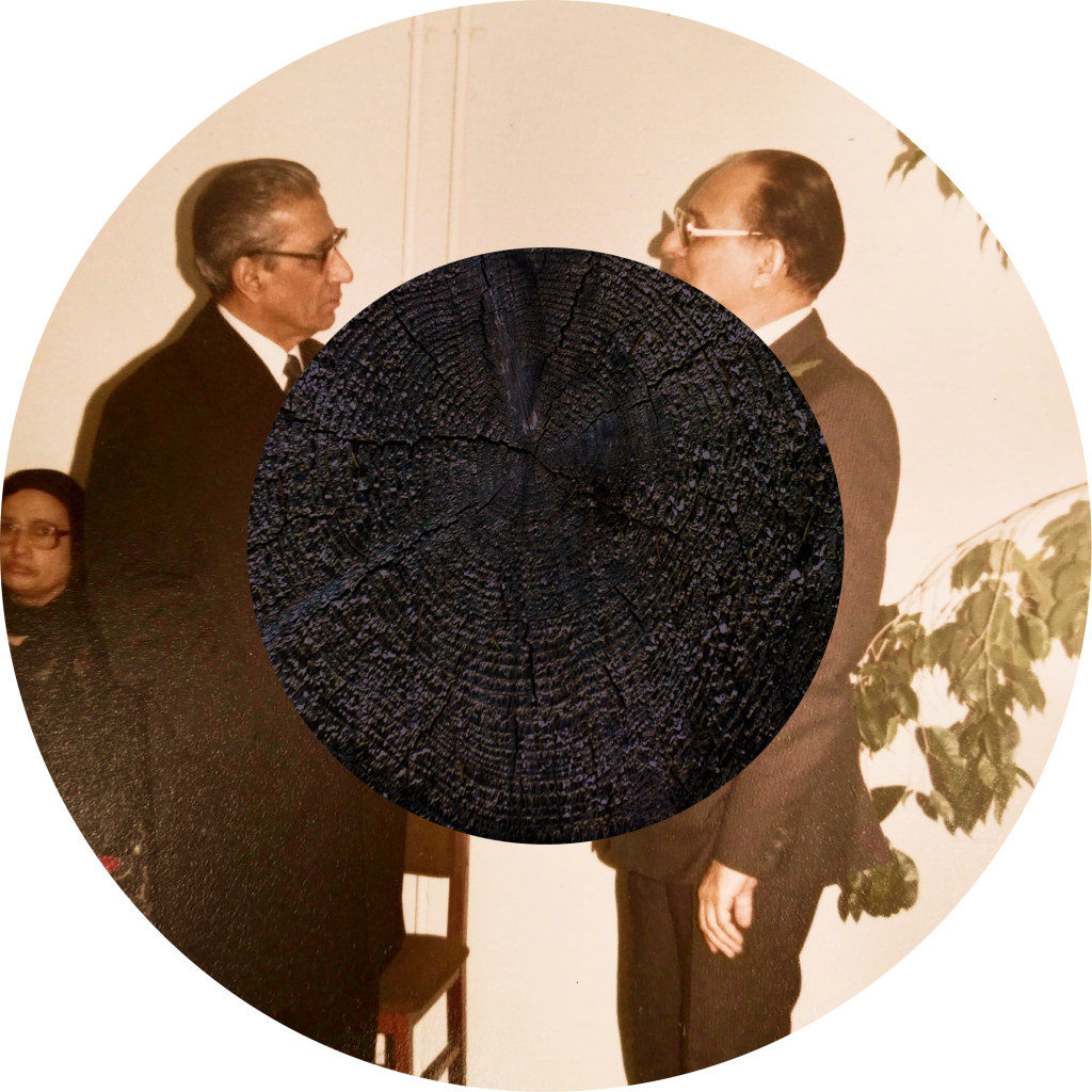
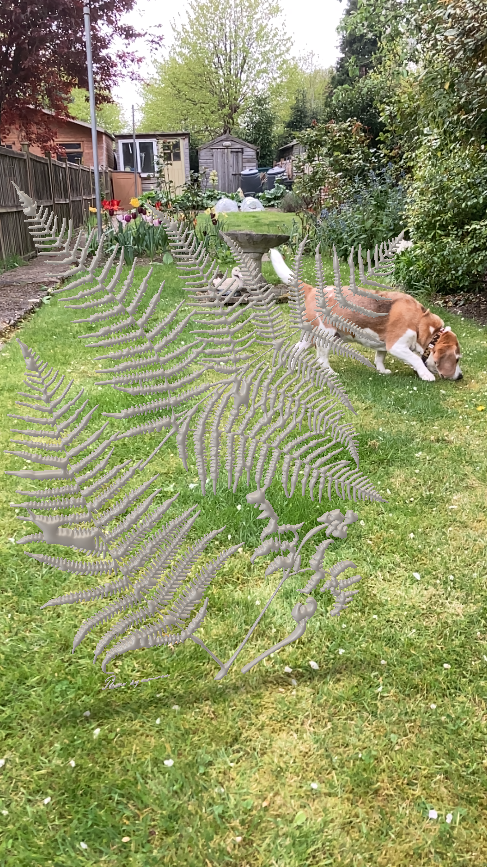
these are my two grandfathers surveying each other
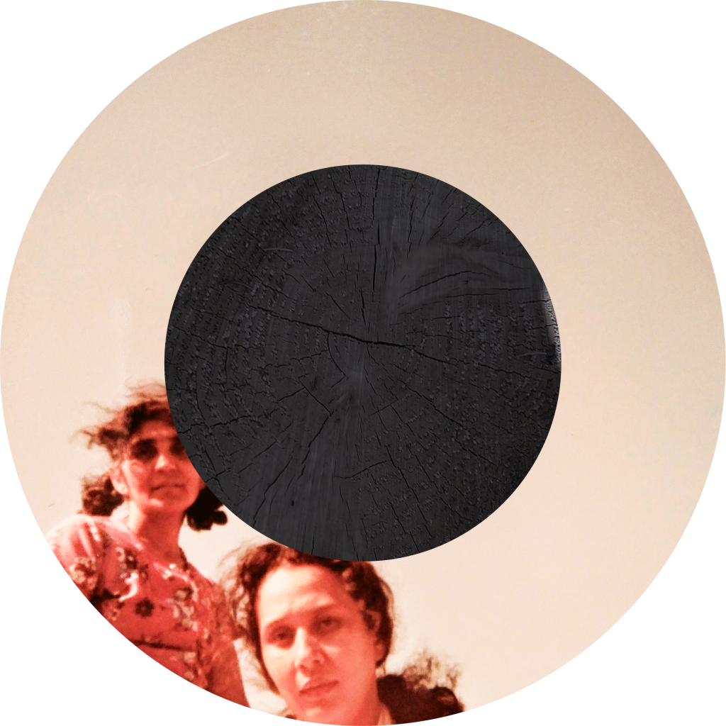
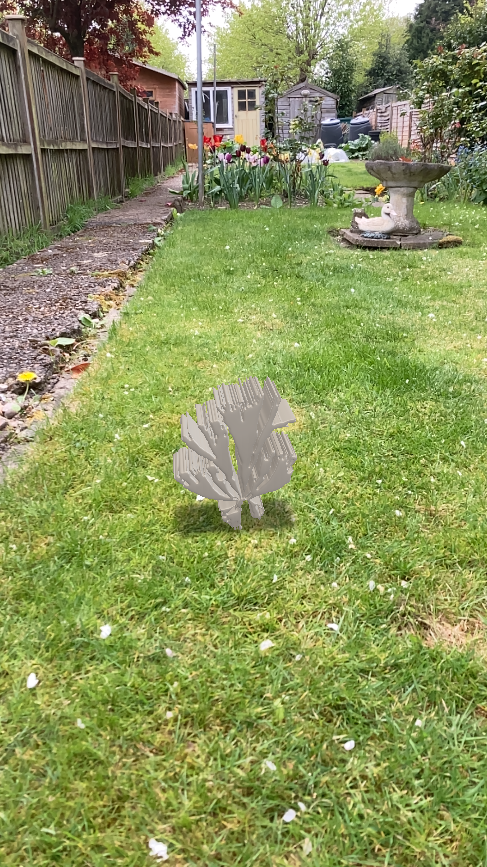
my grandmother and her best friend
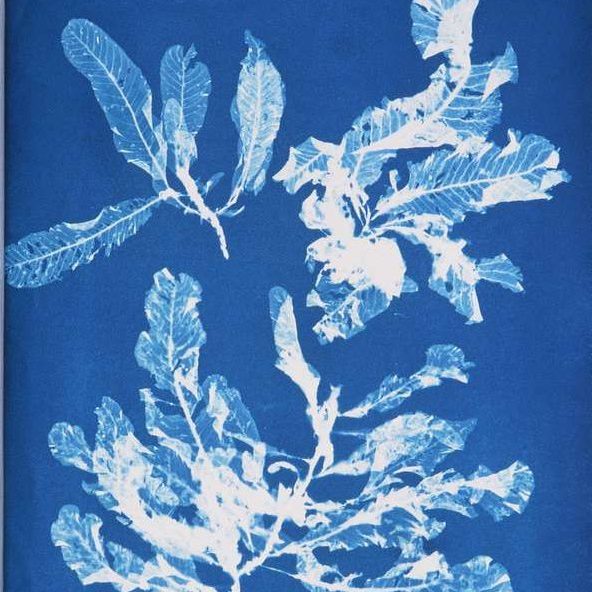
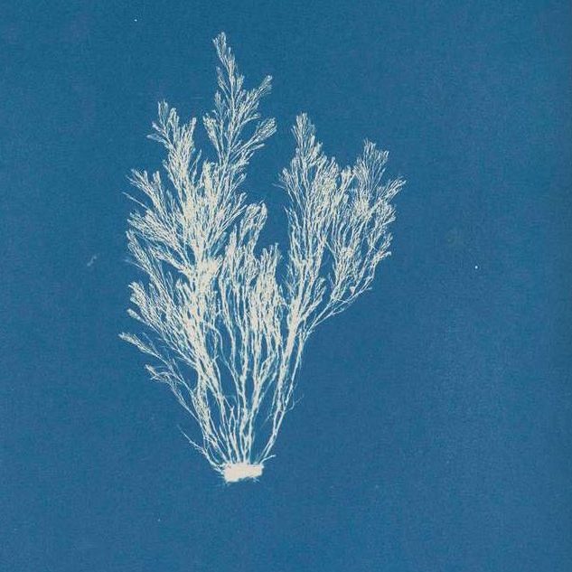
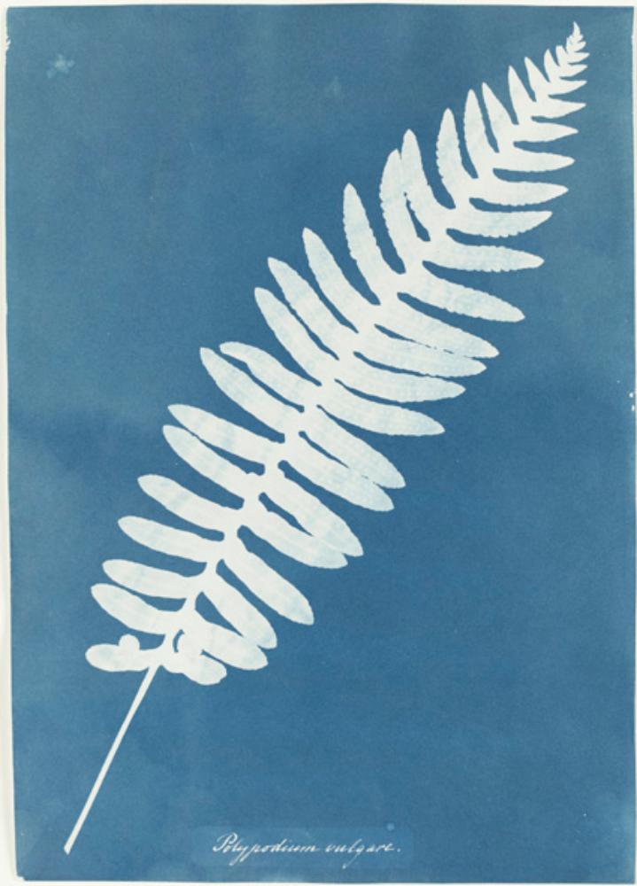
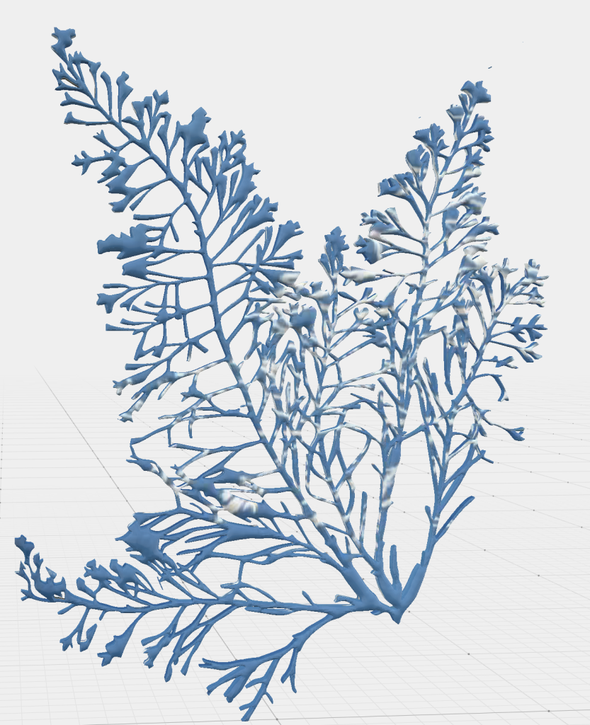
MADE THE SYAHI
Using the image of the chopped down tree stumps, I fashioned the syahi for these tabla’d images, making the symbol of dislocation the central point of attention. Reversing the process from the previous studies, trying to be more direct in the tabla reference and combing through the family pictures. This process has reminded me that so much of this work is about building an archive for/of the family that reconnects the ancestral lineage severed by dislocation.