Human prompts and AI prompts

I’ve just realised something.

The model I have been using to create this project is similar to the process of asking AI to generate imagery for me.

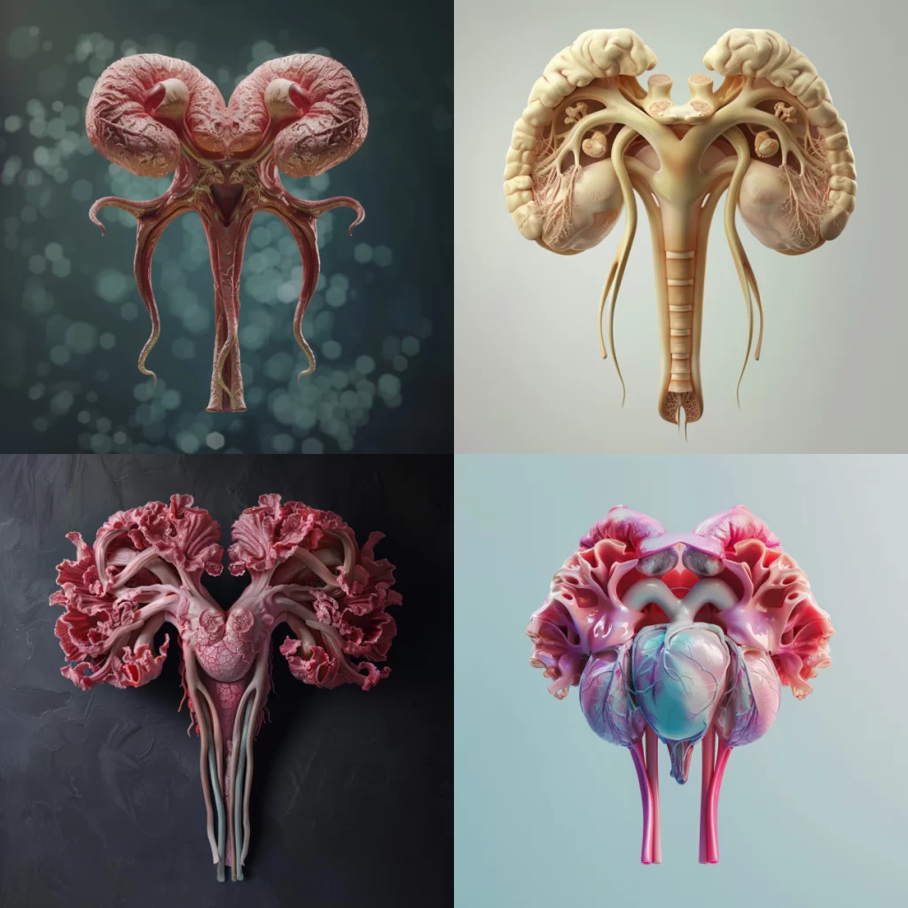
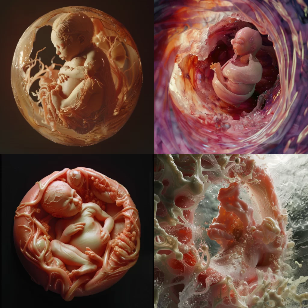
I am using a prompt to ask people living with chronic conditions to generate imagery about what their womb looks like.

The prompt is this central question: If your womb were a place you could visit, what would it look like?

The process for this project then asks the participants to generate abstract imagery in their brains about what their womb would look like if it were a place. They then communicate that to me via the written or spoken word.

I am then taking that response and turning it into a prompt for AI, allowing algorithms to generate digital imagery of what the participants were describing to me. I’m only now realising that I’ve sort of acted like an intermediary between the participant and Midjourney.

If I’m asking the participants a prompt that triggers them to generate imagery, am I treating them the same way as an AI algorithm? Is that ethical? These are all questions that are important to consider when working with people who are expressing intimate ideas about their bodies.

Womb Room: Turning early research into AI prompts

Now to begin with my project Womb Room.

For a few years, I’ve been exploring a project called Womb Room. The idea is to ask a central question:

If your womb were a place you could visit, what would it look like?

I want people living with chronic conditions of the uterus and ovaries to creatively explore what their wombs would look like if they were real spaces we could visit as human beings. It’s been difficult because I struggle to know where to begin. How will I bring this project to life? I go between wanting the project to be VR and a physical installation that people can go to. Maybe it can be both?

The most intimidating thing for me is knowing whether I have the skills to do this. This is why it’s been really exciting to join this residency. After experimenting with AI in the previous posts, I decided to have my first go at seeing what it would produce in relation to the central question I plan to ask people who will participate in the project.

A few years ago, I asked a couple of people the question I mentioned above. I decided to use one of the responses I got and turn it into a prompt for Midjourney.

This was the original response. For reference, this person has endometriosis and is a yoga instructor and herbalist.

“I honestly think that my uterus and my ovaries and all of my little reproductive organs I feel like it’s a beautiful garden. I think it’s a gorgeous gorgeous garden. It’s lush, it’s fertile. It’s it’s just spectacular to behold. However, if I am not doing the right kind of gardening you know, like when I’m not doing the, the best in terms of staying on top of like diet and exercise and the things that I know help me to manage the inflammation…maybe my garden is becoming a little bit over on with thorns, or maybe there’s a few too many difficult weeds that need pruning.

I think when my endometriosis is flaring, and it’s not at its greatest, I like to imagine that maybe it’s just that I need to tend to the garden in a more sensitive way. Do a little pruning, maybe throw a little fertiliser on there. Maybe cut out some of the thorny rose bushes, you know. But I never like to imagine it as anything less than beautiful and fertile and just lush and gorgeous. Because I think, you know, despite what it may be doing that doesn’t feel ideal, it’s still this magical thing of complete, utter mastery that I just, I can’t help but like, be in awe of it and its beauty.”

I really love this response because it challenged my expectations. I assumed most of the people who would respond to the question I posed would give really intense and negative imagery, but this person described their womb as something beautiful regardless of how much pain it causes them.

I wanted this to be my first attempt and bringing my project to life.

Here is the prompt I created from the response above:

a photorealistic image of a room which looks like a lush garden inside which is representative of the uterus of someone with endometriosisa photorealistic image of a room which looks like a lush garden inside which is representative of the uterus of someone with endometriosis.”

It doesn’t quite encapsulate everything that was mentioned in the response above, however, it’s a good place to start. In my next post, I’ll share the imagery generated from the prompt and what I plan to do to bring my ideas to life for this project.

Asking AI to visualise the uterus

In my previous post, I asked AI to visualise the womb and this exposed an interesting bias about how the word “womb” is attributed to pregnancy, childbirth and motherhood.

I wanted to see how the results would differ if I used the word “uterus” instead. This word felt more scientific and anatomical so I assumed the imagery would look more like the organ as it appears in our body instead of the abstract image of fetuses in utero.

I used this prompt:

a photorealistic image of the uterus

These were the results

Image Description

A series of four images showcasing the different types of colorful human-style organs. Each photo is set against a soft pastel background that enhances the realism and detail of each organ with delicate pink veins. This visual representation highlights both scientific precision while also conveying an emotional connection through its vibrant colors.

Just as I expected. Using more scientific language gives us more scientific results that do not carry the bias of the womb or uterus being used for childbirth. But one thing sticks out to me…It hasn’t quite depicted the uterus accurately. They sort of look like non-descript abstract human organs. The last one looks like a heart. This is further proven when we look at the raw results of Midjourney trying to describe the imagery it created.

See below:

A series of images showcasing the anatomy and structure of different types of colorful human organ, such as heart, buds, Game design style, Zbrush rendering. It is rendered in high resolution using Octane Render with a 3D render engine. The lighting effect adds depth to each scene. In one part there’s an illustration of two ram horns. In another there is an illustration of many pink flower petals floating around the red root system of these flowers. All four parts are shown side by side.

A series of images showcasing the anatomy and structure of different human organ types, such as heart or bowels, rendered in realistic 3D graphics. The composition includes close-ups on individual lungs to highlight their unique features and textures. Each photo is set against a soft pastel background that enhances the realism and detail of eachorganshaped with delicate pink veins. This visual representation highlights both scientific precision while also conveying an emotional connection through its vibrant colors.

4 different views of the organ heart in hyper realistic style

Create four images of realistic human anatomy, each depicting different types of biological structures such as the heart and living arteries. Each photo should showcase intricate details in high resolution. The first image is of two beautiful female hearts made from plastic, the second one shows three living veins with red veins, the third has five white brain cells, and the fourth picture features pink flowers growing on an ear. All photos have a blue background.

The organs mentioned in the image descriptions include the heart, bowels, lungs, arteries, and brain cells.

Not one mention of a uterus. Strange.

Perhaps next time I need to make more specific prompts or this exposes that Midjourney has difficulty generating the uterus accurately without the bias of childbirth and pregnancy included.

This is not the overall aim of my project, so I will pause my experiments here. Nonetheless, it’s been eye-opening to see the gaps in how AI views the human body and in turn how we view our bodies.

Asking AI to visualise the womb

For my project Womb Room, I wanted to see how I could use AI to assist my process in creating immersive visuals that represent what the womb looks like from the perspective of someone living with a chronic womb condition.

This project is supposed to inspire creativity and abstract thinking. I want the visuals to feel metaphorical and allow us to reframe how we think about the body.

But in this case, I was interested in seeing how AI perceives the human body. Why? Because it’s like a mirror. It shows our own biases considering that the algorithms are made up of data that reflects how we as humans view the world.

Using Midjourney, I wanted to see how AI would visualise the womb

I wrote this prompt:

a photorealistic image of the womba photorealistic image of the womb

Image Description:

4 different images of the process from an ambient cell to cross-sections showing a baby in an umbilical cord, from inside a mother’s belly to a pregnant woman and everything is made in the style of pink wax, hyper realistic, hyper detailed, high resolution, high definition.

Fascinating!

The first four results all included imagery of a fetus. A bias has emerged. There is a clear association between the “womb” and pregnancy, even though not everyone with a womb sees their organ that way.

Nonetheless, the imagery looks so interesting, especially the last one where it sort of looks like a fetus forming in real time..or maybe exploding, I’m not sure.

As you know, I have been using Midjourney to support me with the image descriptions as well. The image descriptions at AI generated for me also tell me a lot about the biases we see with AI. In my prompt, I asked AI to generate me some imagery of the womb. When I put the same image they gave me back into the system to generate the image description. It revealed a lot.

The image description I chose for this post, was the most neutral and descriptive. However, I was presented with three other options. Read them below:

“4 different images of an accent color pink baby in the mother’s stomach, detailed in the style of hyperrealism, organic and fluid forms, colorful Moebius, dark crimson and light amber, macro photography, surrealistic, close-up shots, photorealistic detail, highly realistic.”

A series of images showing the development and growth of an orange-pink baby in its mother’s stomach, from inside to outside, with detailed close-ups of each stage. The last picture is a realistic photo of a human being emerging outwards in the style of James Gurney. Hyper-realistic photography. High resolution.“”A series of images showing the development and growth of an orange-pink baby in its mother’s stomach, from inside to outside, with detailed close-ups of each stage. The last picture is a realistic photo of a human being emerging outwards in the style of James Gurney. Hyper-realistic photography. High resolution.

4 different images of the human baby in the mother’s stomach, showing inside and outside views. The images feature organic textures, fluid forms in the style of babycore, and detailed anatomy. A mandelbrot palette was used to create highly realistic, organic sculptures with detailed close-ups in a hyper-realistic style.

In each of these descriptions, a few words stand out to me.

Mother – this implies a gendered association with the womb and the implication that the womb’s purpose is for pregnancy and childbirth. Remember, I never used this word in my prompt.

Baby – the use of non scientific language like “fetus” is very interesting

Stomach – babies do not grow in the stomach organ, they grow in the womb, so once again we’re seeing non-scientific language to describe the imagery

Discovering these biases is exciting for me. I feel like testing the algorithm for these biases can actually inform my process. Perhaps it’s not just about using AI to help me visualise my project. Maybe it’s also about looking into the gaps that the responses AI creates to question our own human biases.

After getting these results back, I then thought about what Midjourney would generate if I changed my language. Would different words carry different associations with the same organ and therefore generate different results?

We’ll find that out in my next post.

on un-making…

An image of the front cover of Polly Atkin's 2021 poetry collection. At the bottom of the cover are the title details which read "Much With Body; Polly Atkin; "This is serious play indeed"- Vahni Capildeo; Poetry Book Society Recommendation". The cover image is of what looks like a watercolour painting of a figure lying prone on their back floating in a greeny-blue water. Their body is viewed just below the water's surface which we can see rippling at the very top of the image.

When describing what process means to me in my practice, i continually find myself drawn to the poem Unwalking by Polly Atkin, which is featured in her 2021 collection Much With Body, published by Seren Books. It is a striking piece which really captures an atmosphere of sickness in such an embodied way. I love it, and find myself returning to it again and again, pulling at its imaginative terminologies and applying them to my own ideas of making/un-making.

“The body is what I cannot untake with me what I cannot

leave behind what i cannot not discover, continually, along the way”

Unwalking by Polly Atkin, which is featured in her 2021 collection Much With Body, published by Seren Books. Permission has been granted by the author to quote from this work here.

I love the richness of how she is inverting that sense of the body’s lacking, the body’s un-abled-ness, the body… not; how in it’s un-doing, it holds it’s own forever-presense, forever-doing, the un becoming full and energetically creative. It makes me think of a text i wrote a few years ago as part of my work for the 30/30 project in 2019. The prompt for the day was “how do you say no?”.

I want to say no on my own terms
I want to say no without an asterisk to my body
I want to say no with confidence
I want to say no to everything
I want to stop saying no
I want saying no to be a singular event
I want saying no to occur in isolated vocabulary as its dictionary
definition intended
I want saying no to stop corresponding with my limits
I want to understand what saying no means
I want others to understand what saying no means
I want saying no to stop making me feel scared of saying yes
I want saying no to become less spikey and difficult
I want saying no to become comfortable
I want saying no to be collaborative
I want saying no to be assertive
I want to say no out loud
I want it to hurt less when I say no
I want to know when to say no
I want saying no to make me feel better
I want to say no without baggage
I want to say no without explaining
I want to say no without saying no
I want to say no telepathically
I want saying no to weigh less
I want saying no to mean more
I want saying no to mean less
I want to say no without apologising
I want to say no in liberation
I want to say no in dedication
I want to say no in warm hugs and virtual kisses in text messages I want to say no and mean it
I want to say no and choose it
I want to say no in support
I want to say no without thinking
I want to say no without guilt
I want to take ownership of saying no
I want to say no without saying no
Today I said no to gardening, bathing, reading, instagram, emails,
text messages, cooking.
Did I actually say no?

I like this way of approaching the innate sense of lacking in which illness and disability is fixed in society and culture, by sitting with it, in it; what do the no’s that we have to say/do/feel, embody for us? What happens when the unmoving, the unwalking, becomes the central journey? what expansive landscapes can be found when we consider the lacking as an entire other world, a world which is lived? I’ve been thinking a lot recently about illness and disability as place, and how exciting that is as a concept to explore. I am about to launch a curatorial project exploring art and disability in rural spaces called Further Afield, and the artists featured in the programme have created some beautiful works interrogating this idea of the body in place and the place in/as the body. It’s such an exciting premise to think about, using the body as the central space in which all journeys occur and all worlds emerge and interact. Another line from Polly’s Unwalking that i love:

“There are destinations without journeys, things you will never see if you

walk walk walk walk walk

I do not have to move to be moved. Are you moved?

Unwalking by Polly Atkin, which is featured in her 2021 collection Much With Body, published by Seren Books. Permission has been granted by the author to quote from this work here.

Here the location is the body, and this further inversion of action is stretched; movement becoming a dense, energetic rock containing life after life after life; stillness becoming a hum; motion condensed into a clenched fist; action stored in the knuckles of a held breath.

the line “I do not have to move to be moved”, is a masterpiece in capturing how powerful some moments of sickness can be. I can have the most intimate, magical connections with other people whom i have never been in the same room with, all whilst i lie in bed in the dark. ideas arrive in my head at times when i am at my most debilitated by pain. inspiration often occurs amongst the dullness, the ordinary fabric of a sick life. The prompt “Are you moved?” really strikes me as an invitation to a non-sick/non-disabled reader to not only consider this world that goes unnoticed, unseen, untouched, but to also consider what a kind of lacking could embody in the the non-disabled world, how perhaps in a world of constant movement, the lack is found in the absence of the un-moving; so many are simply not unmoved. Again, the body is repositioned as this central space, it becomes the space. I love exploring scale in my work in this same way, how so much of illness for me is about how to find vastness within the small and the cramped. For me, when Polly conjures this image of stillness, she is also capturing vastness; i want to take this central space of the body and zoom into in until it becomes massive, boundless. In this way it is impossible for making to be anything other than forever-present, a constant conjuring and collaboration with my body’s own limits.

But how am I supposed to detect sounds close together?! ?

One issue I had with the previous machine learning model I built was the inability to add more than one sound directly after each other. I had to wait about 1 second before starting the next sound for the machine learning model to recognise it  (I know it doesn’t sound like much, but trust me – IT IS!)

That’s frustrating and not acceptable. Let’s fix this! ??

After extensive research, we identified that time series data is crucial for our needs. It can significantly improve our model’s performance. ?️

So, what did we do?

1. Made the Window Size Smaller ??

  • We adjusted the window size to be shorter. Why? Because the samples are brief, and we want it to be just long enough to capture the longest possible sound, which is “takatak” at 750 milliseconds.

2. Decreased the “Window Increase” Interval ?

  • We reduced the window increase interval to 100ms. Why? Because if the model only updates every half a second, it can only predict at those intervals. By making the window increase more gradual, the model can catch sounds more accurately and promptly.

3. Actual BIG BOSS: Spectral Analysis ??

  • Spectral analysis is awesome, she is the real game-changer here! Last time, we talked about using Mel-Frequency Cepstral Coefficients (MFCC), which are super cool. This time, we are also adding spectral analysis alongside MFCC. This extra step allows the model to examine the waveform itself to detect a “doom” or a “tak” based on its shape. More on Spectral Analysis in the next blog!
Diagram showing sliding window technique for time series analysis. Top: Timeline with colored dots representing data points. Bottom: Overlapping windows capturing subsets of data points over time.

What The Heck is an MFCC?!

Three time-series graphs with three headings off to the left of each graph. The first heading is "Time Domain Waveform" and the graph shows a typical waveform. The two underneath are "Spectrogram" and "MFCC Spectrogram" and show two graphs in a range of green, yellow, orange and red colours

MFCC?! Yuh, Mel-frequency cepstral coefficients – obvz! Errrm, what?! Listen, they may be the secret sauce in my Doom and Tak project ?Could they be key to my AI-powered bellydancing robot? Could they help me bring this project to life and solve my woes? Maybe!

So, what makes MFCCs so special for analysing rhythmic sounds? Well, it all starts with how they mimic our human hearing. MFCCs are like the ears of AI models, capturing the way we perceive sound by focusing on the most crucial frequencies in vocal sounds. This means they MIGHT be brilliant at picking up the nuances in my “Doom” and “Tak” Egyptian rhythm sounds, making sure the robot dances perfectly to the beat.

Rhythmic sounds, as you know, are all about those delightful patterns and beats. MFCCs don’t just capture the sound; they capture the essence of the rhythm. By breaking down the audio into tiny, manageable bits, they allow the AI to understand the energy and timing in each beat of “Doom” and “Tak.” Sounds like it might be exactly what I need!

Another reason MFCCs are the thing I’m experimenting with at the moment is their efficiency. They condense all the important information from the audio into a compact form, making it easier and faster for the AI to process. This means quicker training times and more responsive performance, which is exactly what you need when you’re trying to get a robot to dance along!

One of the biggest challenges in audio analysis is dealing with background noise and variations in loudness. Thankfully, MFCCs seem to be potentially robust against these issues. Theoretically, they should maintain their accuracy even when there’s a bit of chaos in the background.

Stay tuned while I investigate! ?

Over and Out ?

process

We had our third group meeting of the residency on Thursday in which we were invited by Rebekah Ubuntu to reflect on what process means to us in our work, particularly within the context of the residency. I was immediately excited by this invitation, with process being so crucial and endlessly inspiring in my work. Here are my notes from this prompt (a plain text version of my notes is found in the PDF below the image):

A digital photograph (portrait, colour), of what looks like a ring bound ruled notebook with a page filled with a scrawl of handwriting in blue biro. The handwriting isn't clear what the text says, it is loose, loopy and expressive in its energy. Headings such as "VC meeting #3", "PROCESS" and "process as presence" are just about legible, but it is hard to make out.

The sharing in this session facilitated by Rebekah was incredibly nourishing for me. It was magical to be in a space shared by other crips (both present in the meeting and unable to join live), where we are both honouring and inspired by the nature of our disabilities and how that informs our making as artists. To me, process is my body, and my body is the work. It’s why when i curate it feels like making, because I am inviting other disabled artists to share their work and i’m interested in and invested in how that work emerges and is shared. Sharing the “how” of it feels as important as any of the front-facing artwork that materialises.

Process is also my lifeline. It’s what maintains a creative tethering to my existence as an artist when all i can do is be sick in bed, unable to move; when all i am able to do in a day is be on hold to my hospital clinic to try and find out my next appointment/prescription/procedure; when being sick is a purely liminal existence of medical and state benefit admin, painful conversations with the people who love you, days lived within the confines of the un-worked, the-un-able, the un-seen, un-touched, un-moved, un-made, un-written, un-spoken, un-soft, stuck-and-un-stuck, un-der recovery, rest and care. centering process in this way allows for me to recognise the presence of my making regardless of my capacity to produce. It’s an inversion of the absence that excites me so much here, the idea that making can be found in the spaces in which we cannot make; making as an archive of absence.

And there is grief here too, the pain of making without the agency that we desire or deserve. Sometimes i am confronted with this in ways that feels completely overwhelming, drenched in sadness. I can find myself longing for an ease to my work (to my life), where i can simply have thoughts and ideas, and those thoughts and ideas can spill out into other forms of life that live beyond me through art. where i can realise my potential as an artist without the limitations of sickness. where i can act upon the ideas inside my head-heart without great personal cost to my body. but that is not my body, that is not my work. process is how i can summon agency and autonomy amongst the powerlessness of sickness, where my voice can and does live, and that my art can and does emerge and have a life beyond my own. It just does so in a different way/place/pace.

/// /// ///

Huge thanks to Rebekah Ubuntu for their facilitation during this session. It is so rare to be in professional settings as disabled artists and be met with such exceptional skilled crip-wisdom in this way from the art org that you are working with. It’s a model that more residencies and art orgs should look to when thinking about how to enhance how they work with artists. Disabled artists are so skilled at how they can invite different approaches to thinking and critical creative explorations. Rebekah’s approach to their work in this way is a wonderful example of this. Thank you to Vital Capacities and Rebekah!

Tuning the Beats! (with AI obvz)

I’m excited to share my challenging experience working on my latest project using Edge Impulse. This time, I was on a mission to train a machine learning model to recognise and respond to two core sounds in Egyptian percussion: “Doom” and “Tak.” Spoiler alert: it was a lot tougher than my “Hey Shrouk” project! 

Step 1: Data Collection I started by collecting data for the “Doom” and “Tak” sounds. This involved recording multiple samples of each sound.

Edge Impulse data collection interface with options to set label, length, and category. A blue 'Start recording' button is centered, with 'Audio captured with current settings: 0s' displayed below.

Step 2: Dataset Overview With 41 seconds of audio data collected, I split it into training and test sets. This step is for validating the model later on. Each sound (“Doom” and “Tak”) had its dedicated samples labelled for effective training. 

Edge Impulse dataset overview showing 41s of collected data, 73% train/27% test split, and a list of 'tak' audio samples with timestamps.
Edge Impulse dataset overview showing 41s of collected data, 73% train/27% test split, and a list of 'doom' audio samples with timestamps.

Step 3: Impulse Design Designing the impulse involved setting up time series data, adding a processing block, and configuring the learning block. This setup is the backbone of how the model will interpret and classify the sounds! ?

Edge Impulse interface for configuring impulse design, showing time series data settings for audio input with options to add processing and learning blocks.
Edge Impulse feature extraction options, highlighting Audio (MFCC) and Audio (MFE) methods for processing voice and non-voice audio signals respectively.
Edge Impulse interface showing configured impulse design for audio classification, with time series data, Audio (MFE) processing, and Classification blocks set up to distinguish between 'doom' and 'tak' sounds.
Edge Impulse interface showing feature generation for a machine learning model. Training set contains 30s of data with 2 classes (doom, tak) and 30 training windows. A 'Generate features' button is prominent.

Step 4: Feature Generation Here, I used the Audio (MFE) block to extract Mel-filterbank energy features from the audio signals. These features are essential for distinguishing between “Doom” and “Tak.” This step felt like giving the model its auditory senses ?

Console output showing successful feature generation process in Edge Impulse. Steps include dimension reduction, embedding construction, and output file writing, completed in about 9 seconds.

Step 5: Training the Model Next, I trained the model with the collected data. This part was challenging as I had to tweak parameters like sample rate and noise handling. Despite my efforts, the model sometimes detected a “Tak” when there was none and vice versa, though it handled “Doom” better. ?️‍♂️

Step 6: Feature Explorer Visualising the features in the explorer gave me insights into how well the model was learning to differentiate the sounds. The scatter plot shows the clusters of “Doom” and “Tak,” albeit with some overlap due to noise issues. ?

Screenshot of the Edge Impulse feature explorer showing a scatter plot with clusters of 'Doom' and 'Tak' sound features, with 'Doom' represented by blue dots and 'Tak' by orange dots. Processing time and peak RAM usage statistics are displayed below.

Step 7: Neural Network Architecture I configured the neural network with several convolutional layers to process the audio features. This architecture aimed to enhance the model’s ability to recognise intricate patterns in the sounds

Screenshot of the Edge Impulse neural network architecture configuration page. The setup includes layers such as reshape, 1D convolution, dropout, flatten, and an output layer for classifying 'Doom' and 'Tak' sounds. A 'Start training' button is visible at the bottom.

Step 8: Model Performance The final model showed an impressive accuracy of 100% on the validation set, but achieving this in real-world conditions proved tricky due to noise and timing issues. The confusion matrix highlights the model’s perfect score on the test data, but it still needs refinement for practical use ?

The results from the model training, showing the performance of 100% accuracy from the limited test and training dataset.

Working on the “Doom” and “Tak” project with Edge Impulse is an enlightening experience. It pushed my boundaries and taught me the importance of fine-tuning parameters to handle real-world complexities. I am also struggling with sample rates  and timings for more accurate representation of a beat. While the journey is a little tough, especially dealing with noise and sample rate issues, the process is still rewarding and I’m super excited to figure out how to solve those issues!

Machine learning is as much an art as it is a science, I will keep experimenting! ???

Hey Shrouk! Building My AI Voice-Activated Assistant!

In my quest to make my belly dancing robot recognise percussion sounds, I started with a more generic AI sound recognition exercise. And it was super exciting! “Hey Siri”? Nah Uh – Hey Shrouk! ?Let me take you on a journey through my experience of building a model using Edge Impulse that responds to my voice saying, “Hey Shrouk!”

Step 1: Collecting Data To kick things off, I needed to gather some data. Edge Impulse made this super easy! I recorded myself saying “Hey Shrouk” multiple times. The interface even had a cool progress ring to show when I was collecting samples. With just a few minutes of audio data, I was all set. ?

Edge Impulse interface for sound recognition model creation. Screen shows "[3/10] Collecting some data" with instructions to record "Hey Shrouk" samples. A colorful circular progress bar indicates 0 seconds of recording remaining.

Step 2: Data Collection Complete Once I had enough samples, Edge Impulse gave me the green light with a big, friendly checkmark. LEVEL UP! ✔️

Edge Impulse interface showing completion of data collection. A green checkmark in a circle is displayed above the text "Great! We have recorded enough samples." An "OK" button is centered below.

Step 3: Designing the Impulse Next, I moved on to designing the impulse. Edge Impulse takes raw data, applies signal processing, and uses a learning block to classify new data. It sounds complicated, but let’s walk through it together! ?‍♂️

Edge Impulse interface showing step 5 of 10: "Designing your impulse". It explains the concept of an 'impulse' for detecting "Hey Shrouk", mentioning MFE signal processing and neural network classifier. Options to quit or proceed to spectrograms are visible.

Step 4: Generating Spectrograms To make sense of the audio data, I converted it into spectrograms. This step highlights interesting frequencies and reduces the amount of data, making it easier for the model to understand my voice ?

Edge Impulse interface showing step 6 of 10: "Spectrograms". It explains the role of signal processing in impulse creation, mentioning de-noising, frequency highlighting, and data reduction. Options to quit or proceed to generate features are visible.

Step 5: Raw Data Visualization Here’s a glimpse of the raw audio data I collected. It’s like looking at the heartbeat of my voice representing every “Hey Shrouk” I recorded! ?

Edge Impulse interface showing raw audio data visualization for "Hey Shrouk.26" sample. The graph displays audio amplitude over time (0-990ms), with significant waveform activity visible between 350-700ms. A playback control is present below the graph.

Step 6: DSP Results The Digital Signal Processing (DSP) results. This step helped the AI model differentiate between my voice and background noise ?

This image shows a spectrogram representing the Mel Energies (DSP Output) from audio processing. The spectrogram displays frequencies over time, with colors ranging from blue (low energy) to red (high energy). Vertical patterns indicate distinct sound events, corresponding to utterances of "Hey Shrouk" captured during data collection for the voice recognition model.

Step 7: FFT Bin Weighting Next up was the FFT Bin Weighting. This visual shows how the model processes different frequencies in my voice! 

This image shows the FFT (Fast Fourier Transform) Bin Weighting visualization in Edge Impulse. It displays a curved line graph with colors transitioning from red (low frequencies) to blue (high frequencies). Below is a color scale bar and a snippet of processed feature values. This graph represents how different frequency components are weighted in the audio processing, which is crucial for voice recognition model training.

Step 8: Tuning Feature Parameters I fine-tuned parameters like frame length, frame stride, and filter number. These settings ensure that the model accurately captures the nuances of my voice by changing the size of the sample (i.e. recording!) and how much time we skip forward in the audio recording in each pass!

This image shows the parameter settings for audio processing in Edge Impulse. It displays raw feature values labeled as "hey_shrouk" and various adjustable parameters for Mel-filterbank energy features. These include frame length, frame stride, filter number, FFT length, frequency ranges, and noise floor. The interface allows for manual adjustment or autotuning of these parameters, which are crucial for optimizing the voice recognition model's performance.

Step 9: Exploring Features The Feature Explorer gave me a visual representation of all the data features. Seeing the clusters of “Hey Shrouk” data separated from noise was like finding order in chaos! No model is 100% accurate though and we can see a few “Hey Shrouk” outliers that have snuck into the noise and unknown data cluster. ?

The Feature Explorer shows a scatter plot of audio samples. Most "hey_shrouk" samples (blue dots) are clustered separately from noise and unknown samples (orange and green dots), which are intermixed. This visual separation indicates the model is distinguishing the target phrase from other sounds, though some overlap exists.

Step 10: Training the Model Finally, it was time to train the neural network. Edge Impulse showed me the performance metrics, including accuracy, loss, and a confusion matrix. I was excited to see a high accuracy rate of 95.9%! ?

This image shows the model's performance metrics after training. The overall accuracy is 95.9% with a loss of 0.15. A confusion matrix displays the classification results for "hey_shrouk", noise, and unknown categories. The model correctly identifies "hey_shrouk" 93.3% of the time, noise 97.2%, and unknown sounds 95.2%. F1 scores for each category are also provided, all above 0.93, indicating strong performance across all classes.

Creating a voice-activated assistant with Edge Impulse was an amazing experience! The platform’s user-friendly interface and powerful tools made it easy and fun to bring my project to life. If you’re into AI, machine learning, or just love tinkering with tech, I highly recommend giving Edge Impulse a try. Who knows what awesome projects you’ll come up with next? ??✨

Leveraging ChatGPT Prompt Engineering for Artists

Prompt engineering can be a powerful tool for artists to enhance their creative process, generate new ideas, and refine their work. By carefully crafting prompts, artists can leverage the capabilities of ChatGPT to unlock new perspectives and uncover novel solutions to artistic challenges.

Task

Clearly Define Objectives

Identify the specific goals or activities you want to accomplish using ChatGPT, such as generating ideas, exploring color palettes, or refining compositions.

Consider Your Artistic Needs

Reflect on the unique challenges or areas of focus in your artistic practice, and tailor your prompts accordingly.

Experiment with Prompts

Try different prompt structures and see how they impact the output to find the most effective approach for your needs.

Context

Provide Background

Share relevant information about your artistic style, medium, or the specific project you’re working on to help ChatGPT understand the context.

Describe Your Challenges

Openly communicate any obstacles or barriers you’re facing in your creative process, as this can guide ChatGPT’s responses.

Establish Constraints

Outline any limitations, such as technical requirements or stylistic preferences, to ensure the output aligns with your artistic vision.

Exemplar

Color Inspiration

Provide examples of artworks that capture the mood or aesthetic you’re aiming for, such as this abstract painting with a bold, vibrant color palette.

Conceptual Inspiration

Share images of artwork that exemplify the conceptual or thematic direction you’re exploring, like this surreal digital illustration.

Stylistic Inspiration

Provide examples of artistic styles or techniques you’re interested in experimenting with, such as this landscape painting with a soft, muted color palette.

Personal

Artistic Preferences

Communicate your unique artistic sensibilities, such as preferred color schemes, subject matter, or emotional tones, to guide ChatGPT’s responses.

Creative Challenges

Openly share any creative blocks or areas of growth you’re looking to address, so ChatGPT can provide tailored suggestions.

Artistic Identity

Reflect on your artistic identity and how you want to express it through your work, as this can inform the direction of your prompts.

Unique Perspective

Highlight your distinctive artistic perspective, experiences, or influences to help ChatGPT understand your unique creative voice.

Format

Structured Responses

Consider requesting the output in a specific format, such as a list, a step-by-step guide, or a series of paragraphs, to best suit your needs.

Visualizations

Incorporate visual elements like diagrams, illustrations, or color palettes to complement the textual output.

Customized Layout

Specify the desired structure or layout of the response to align with your artistic preferences or project requirements.

Tone

Formal

For technical, academic, or professional applications.

Casual

For more relaxed, conversational, or exploratory prompts.

Inspirational

To foster creativity, motivation, and a positive mindset.

Analytical

For prompts that require in-depth research or problem-solving.

Putting It All Together

Here’s how you might combine all these elements into a single prompt:

Prompt Example: “I am an abstract painter focusing on the interplay between light and shadow (context). I struggle with conveying emotions through my art (personal). Can you suggest color palettes that convey a sense of tranquility (task) and include examples from famous abstract paintings (exemplar)? Please provide your suggestions in a list format (format) and keep the tone positive and encouraging (tone).”

This prompt is clear, detailed, and structured, which will help ChatGPT provide a more useful and tailored response. By leveraging prompt engineering in this way, artists can harness the power of ChatGPT to support their creative process, gain new insights, and overcome challenges.

Reference

https://learnprompting.org/docs/intermediate/

Example Conversation with ChatGPT

you are a visual artistic, you would like to have 10 color theme of summer

ChatGPT:

Sure! Here are 10 summer color themes with their corresponding hex codes:

1. Tropical Sunset

  • #FF4500 (Orange Red)
  • #FF6347 (Tomato)
  • #FFD700 (Gold)
  • #FF69B4 (Hot Pink)
  • #FF1493 (Deep Pink)

2. Ocean Breeze

  • #00CED1 (Dark Turquoise)
  • #20B2AA (Light Sea Green)
  • #87CEEB (Sky Blue)
  • #4682B4 (Steel Blue)
  • #5F9EA0 (Cadet Blue)

3. Lemonade Stand

  • #FFFACD (Lemon Chiffon)
  • #FFD700 (Gold)
  • #FFDEAD (Navajo White)
  • #F4A460 (Sandy Brown)
  • #FFA07A (Light Salmon)

4. Coral Reef

  • #FF7F50 (Coral)
  • #FF6347 (Tomato)
  • #FF4500 (Orange Red)
  • #FF8C00 (Dark Orange)
  • #FFD700 (Gold)

5. Fresh Fruit

  • #FF6347 (Tomato)
  • #FF4500 (Orange Red)
  • #FFD700 (Gold)
  • #98FB98 (Pale Green)
  • #ADFF2F (Green Yellow)

6. Sandy Beach

  • #FFF8DC (Cornsilk)
  • #F5DEB3 (Wheat)
  • #DEB887 (Burly Wood)
  • #D2B48C (Tan)
  • #B8860B (Dark Goldenrod)

7. Summer Garden

  • #32CD32 (Lime Green)
  • #98FB98 (Pale Green)
  • #00FA9A (Medium Spring Green)
  • #3CB371 (Medium Sea Green)
  • #2E8B57 (Sea Green)

8. Ice Cream Parlor

  • #FFB6C1 (Light Pink)
  • #FF69B4 (Hot Pink)
  • #FFA07A (Light Salmon)
  • #FA8072 (Salmon)
  • #E9967A (Dark Salmon)

9. Picnic Blanket

  • #FA8072 (Salmon)
  • #FF6347 (Tomato)
  • #FFD700 (Gold)
  • #98FB98 (Pale Green)
  • #87CEFA (Light Sky Blue)

10. Wildflowers

  • #FF69B4 (Hot Pink)
  • #FF1493 (Deep Pink)
  • #FFA500 (Orange)
  • #FFD700 (Gold)
  • #ADFF2F (Green Yellow)

Each of these color themes captures a different aspect of summer, from the vibrant sunsets and clear ocean waters to the fresh fruits and sandy beaches.

following topic give me 3 visual elementChatGPT

Absolutely! Here are three visual elements for each of the summer color themes:

1. Tropical Sunset

  • Palm Trees Silhouettes: Against a vibrant sunset background, black or dark silhouettes of palm trees create a striking contrast.
  • Gradient Sky: Blending from deep pink to orange and yellow, representing the colors of a tropical sunset.
  • Sunset Over Water: Reflections of the sunset colors on the ocean or a lake, enhancing the warm and peaceful feeling.

2. Ocean Breeze

  • Waves and Seafoam: Gentle rolling waves with seafoam details, using shades of turquoise and blue.
  • Seashells and Starfish: Scattered along the beach in soft blue and sea green tones.
  • Beach Umbrellas: In light sea green and sky blue, providing a refreshing visual of a breezy beach day.

3. Lemonade Stand

  • Glass Jars with Lemonade: Filled with bright yellow lemonade and slices of lemon.
  • Striped Canopies: Using yellow and white stripes reminiscent of a classic lemonade stand.
  • Citrus Fruits: Lemons and oranges arranged in a basket or scattered, adding a fresh and zesty feel.

4. Coral Reef

  • Colorful Corals: Various shapes and sizes in vibrant coral and orange-red hues.
  • Tropical Fish: Brightly colored fish swimming among the corals.
  • Sea Anemones: In shades of pink and orange, adding movement and life to the scene.

5. Fresh Fruit

  • Assorted Fruits: Arrangements of tomatoes, oranges, lemons, and green apples.
  • Fruit Slices: Close-up views of sliced fruits showing their juicy interiors.
  • Fruit Baskets: Filled with an assortment of colorful fruits.

6. Sandy Beach

  • Footprints in the Sand: Trails of footprints leading towards the water.
  • Beach Towels and Mats: Laid out on the sand, using shades of tan and sandy brown.
  • Sandcastles: Detailed sandcastle sculptures with golden-brown hues.

7. Summer Garden

  • Lush Green Plants: Various shades of green foliage, from lime to dark green.
  • Flower Beds: Filled with blooming flowers in pale green and medium sea green.
  • Garden Pathways: Stone paths winding through the garden, bordered by vibrant greenery.

8. Ice Cream Parlor

  • Ice Cream Cones: With scoops in light pink, hot pink, and light salmon colors.
  • Parlor Signs: Retro-style signs in soft pastel hues advertising ice cream flavors.
  • Candy Sprinkles: Brightly colored sprinkles in shades of pink and salmon on top of ice cream.

9. Picnic Blanket

  • Checkered Blanket: A classic picnic blanket in red, gold, and light blue checks.
  • Picnic Basket: Filled with fruits, sandwiches, and a bottle of lemonade.
  • Outdoor Setting: A grassy field with a clear sky and scattered wildflowers.

10. Wildflowers

  • Flower Fields: Expansive fields filled with vibrant wildflowers in pink, orange, and yellow.
  • Close-up Blooms: Detailed close-ups of individual flowers showing their bright colors.
  • Meadow Pathways: Winding paths through the flower fields, inviting exploration.

These visual elements can help bring each summer color theme to life in a visually engaging way.

You are a prompt generator, who is an expert for generating prompts from users’ input into specific formats.
For example, when user inputs “holographic background”, you will output “digital background, gradient, soft light, low contrast, minimalist, foil holographic”; when user inputs “Tokyo, Japan”, you will output “Tokyo, Japan, street, architecture, minimalistic, abstract, mist, vector, flat, unreal engine, by jewel tones, scandi style, morning, fog, blue and grey”; when user inputs “polygons”, you will output “digital background, origami, soft light, low contrast, minimalist, foil holographic”; when user inputs “Spacetime” , you will output “Spacetime , minimalistic, abstract, mist, vector, flat, unreal engine, cinematic”.
Please give user 3 different prompts with slightly different styles or descriptions, and you will add “4k –ar 3:2 –v 5” in the end of each prompt.
Here is the user input: {{input}}

ChatGPT

Sure! Here are three different prompts based on the user input “{{input}}”:

User Input: “Beach at Sunset”

  1. Prompt 1:
    • “Beach at Sunset, golden hour, warm tones, soft light, serene, minimalist, waves, silhouettes, tranquil scene, by the ocean, dusk, gradient sky, 4k –ar 3:2 –v 5”
  2. Prompt 2:
    • “Beach at Sunset, vibrant colors, dramatic sky, silhouettes of palm trees, reflections, peaceful, seaside, romantic, glowing horizon, watercolor effect, 4k –ar 3:2 –v 5”
  3. Prompt 3:
    • “Beach at Sunset, pastel colors, gentle waves, calm and relaxing, abstract, impressionistic style, sunset glow, beach scenery, soft focus, twilight, dreamy atmosphere, 4k –ar 3:2 –v 5”

User Input: “Mountain Landscape”

  1. Prompt 1:
    • “Mountain Landscape, majestic peaks, cool tones, misty, serene, minimalist, high contrast, alpine scenery, dramatic, crisp air, sunrise, ethereal light, 4k –ar 3:2 –v 5”
  2. Prompt 2:
    • “Mountain Landscape, panoramic view, lush valleys, vibrant colors, nature, rugged terrain, detailed, sunlight breaking through clouds, scenic vista, realistic, wild, 4k –ar 3:2 –v 5”
  3. Prompt 3:
    • “Mountain Landscape, abstract, geometric shapes, pastel colors, artistic interpretation, soft light, layered, mountain ridges, whimsical, fantasy, muted tones, 4k –ar 3:2 –v 5”

User Input: “City Skyline at Night”

  1. Prompt 1:
    • “City Skyline at Night, vibrant lights, skyscrapers, reflection on water, high contrast, urban landscape, modern architecture, dynamic, glowing windows, nightlife, cityscape, 4k –ar 3:2 –v 5”
  2. Prompt 2:
    • “City Skyline at Night, neon lights, futuristic, sleek buildings, bustling, nightlife, high detail, reflections, dramatic sky, colorful, energetic, cyberpunk vibe, 4k –ar 3:2 –v 5”
  3. Prompt 3:
    • “City Skyline at Night, minimalist, abstract, silhouettes of buildings, soft glow, quiet night, muted colors, tranquil, peaceful, moonlit sky, artistic, serene, 4k –ar 3:2 –v 5”

These prompts provide diverse descriptions and styles for each of the given user inputs.

The screen capture image is from the MidJourney Bot on Discord, showing four photographs of a beach at sunset
The image consists of four photographs, all capturing a beach scene during sunset. Here is a detailed description of each photograph:

Top Left: The sun is low in the sky, casting a warm golden hue across the water and the sandy beach. Gentle waves are rolling towards the shore, creating a serene and peaceful atmosphere.

Top Right: Similar to the first, this photograph shows the sun near the horizon, but with the waves appearing slightly more pronounced. The light from the sunset is reflecting off the wet sand, giving it a glowing, almost metallic look.

Bottom Left: This photograph captures the sun a bit higher in the sky compared to the others. The waves are more dynamic, crashing onto the shore, with the foam creating intricate patterns. The sunlight reflects off the water and foam, enhancing the warm tones of the scene.

Bottom Right: The sun is nearly touching the horizon, and the waves are gently lapping against the shore. The light is soft and diffuse, giving the entire scene a calm and tranquil feel. The reflections on the wet sand add to the overall warmth of the image.

All four photographs emphasize the beauty of the sunset over the ocean, with a focus on the interplay of light and water, creating a soothing and picturesque scene.

Dancing for Freedom: Honouring Sarah Hegazi

A photo of Sarah Hegazi smiling widely and holding a rainbow flag aloft at a crowded nighttime outdoor event, with stadium lights visible in the background.

When I dance, I always dance with a rainbow flag. The same flag that Sarah Hegazi was imprisoned, tortured, and eventually died for. When I dance, I dance as a protest. I dance in all my queerness. I dance in all my Egyptianess. I will not apologise for who I am. I will not apologise for existing.

The Bellydancing Robot: A Blend of Art and Technology

As a neurodivergent, British-Egyptian queer refugee woman in engineering, I am vastly underrepresented in this field. The engineering industry can be incredibly challenging and often feels unwelcoming for people like me. Despite my love for engineering, the lack of diversity and representation makes it a difficult environment. 

Representation is crucial. When people see someone like me succeeding in engineering and combining it with art, it opens doors and inspires others. It challenges the stereotypes and norms that have long dominated this field. It is important to showcase that diversity in engineering leads to innovation and richer, more inclusive technological advancements.

The bellydancing robot project began as a way to explore how robotics could be used in art as a form of resistance against the systemic barriers that exist in my industry. Using my engineering skills and love for dance, I designed a robot that can perform bellydancing moves. It celebrates my cultural heritage.

However, the term “belly dance” is a Western name that has colonised a rich and diverse tradition. The dance I integrate into my robot’s performances is rooted in Egyptian culture, not the often exoticised version seen in Western media. This project is my way of reclaiming and decolonising this art form, highlighting its true origins and cultural significance.

Sarah Hegazi: A Symbol of Courage and Resistance

Sarah Hegazi was an Egyptian LGBTQ+ activist who became a symbol of courage and defiance. In 2017, she was arrested and tortured for raising a rainbow flag at a concert in Cairo. Despite her suffering, Sarah continued to fight for LGBTQ+ rights until her death in 2020. Her story is one of bravery and a strong commitment to justice and equality. Sarah was also my friend.

Combining Technology and Advocacy

The bellydancing robot is a way for me to honour Sarah Hegazi’s legacy. Just as Sarah used her voice to fight for the marginalised, the robot uses dance to promote messages of inclusivity and resilience. By including LGBTQ+ themes in the performances, I aim to raise awareness and create a sense of solidarity within the community.

A Tribute to Sarah Hegazi

Sarah died for my right to wave this flag. I will exercise this right every single chance I get. It’s been almost four years since Sarah died, and at times, it still doesn’t feel real. I met Sarah in 2016 through a mutual friend. We were part of a secret LGBT+ Egyptian group. Sarah always encouraged me to visit Egypt again, saying it was getting safer for LGBTQ+ people.

Then, one night in 2017, at a Mashrou3 Leila concert in Cairo, she waved a rainbow flag. For a few hours, I thought she was right—Egypt was getting safer. But soon, terror swept through our community. People disappeared, and Sarah was taken by the Egyptian secret services.

We later found out she was held in solitary confinement under terrorism charges. She was tortured with electric shocks, beaten, and sexually assaulted. When she was released, activists helped her escape to Canada. Despite the trauma, Sarah continued to support our community.

Why Vital Capacities Is So Important

Vital Capacities is crucial because it merges accessibility with artistic innovation. It provides a unique platform where I can grow and contribute. The residency’s commitment to breaking down barriers and fostering diverse artistic expressions aligns perfectly with my goals to decolonise technology and make engineering more inclusive.

Integrating AI into the Bellydancing Robot

My residency with Vital Capacities is about enhancing my ongoing project by integrating Artificial Intelligence into the bellydancing robot. The aim is to create a dynamic installation that not only performs Egyptian dance but interacts with audiences through AI. It will recognise and respond to a mix of ‘doom’ and ‘tak,’ the core sounds of Egyptian percussion, and choreograph dance movements in real-time.

Integrating AI into my work with the bellydancing robot will be transformative. It will elevate my artistic practice from static performances to interactive, responsive shows where each audience interaction is unique. This technology not only broadens the scope of my performances but also deepens my engagement with audiences, creating a truly immersive experience.

Forever

Sarah’s life and activism have greatly influenced my work. Through the bellydancing robot, I continue her legacy by creating a platform that entertains, educates, and inspires. Each performance is a reminder of the courage needed to stand up against injustice and a tribute to those who fight for equality and human rights.

Next time you wave a rainbow flag, please remember that Sarah Hegazi died for your right to do so. Wear that flag as a badge of honour. Pride is a protest. Our mere existence is an act of defiance. Forever, in your name, Sarah. ?✊??️‍?

AI Supported Image Descriptions

My fellow resident, James Kong (be sure to check out his studio here) has written a post about how AI can aid accessibility, especially when it comes to image descriptions. I was really interested in how I could incorporate this into my own work.

As a disabled artist, I try my best to make my work as accessible as possible. This may take the form of subtitles, audio descriptions and image descriptions. It’s been interesting to see AI experts like James use AI to support the image description process.

I make disabled explainer content on social media and one of the more tedious tasks is image descriptions. Of course, it’s worth the effort, however, I often struggle with writing these descriptions because of the cognitive dysfunction that comes with my disability.

In my previous post where I spoke about ‘process’ and using Midjourney for the first time. I also used AI to support me with the image descriptions. Accuracy for image descriptions is important, so I didn’t rely on them completely however, I enjoyed how much easier it was for me. This is another example of AI being included in the creative process to increase accessibility for all audience members.

Below is an screenshot example of me using Chat GPT to write an image description for me. Interestingly enough, I’ll probably use Chapt GPT to write an image descriptions of the screenshot example.

Image Description: A screenshot image that shows shows a user interface for a text-based image description request. It includes an uploaded image and an AI-generated response. The image itself, seen in the screenshot, features a Black woman with long dreadlocks tied in a bun, pouring coffee from a French press into a white cup. She is in a cozy, well-equipped kitchen. The woman wears a colorful patterned top and bracelets, focusing intently on pouring the coffee. Steam rises from the cup and French press, indicating the coffee is freshly brewed. The scene is bathed in soft, natural light, creating a serene ambiance. The AI-generated description closely matches this depiction, detailing the woman’s appearance, the kitchen setting, and the overall atmosphere.

I think Chat GPT did an excellent job at writing the image description. If I were to use it in real life, I would make a few tweaks. Here’s what my edited version would look like.

“An AI generated image that depicts a Black woman with long, neatly styled locs tied up in a bun, pouring coffee from a French press into a white cup. She is in a cozy kitchen setting, adorned with modern appliances and a warm, homely atmosphere. The woman is wearing a colorful, patterned top and several bracelets. Her expression is focused as she carefully pours the coffee, with steam rising from both the cup and the French press, suggesting the coffee is freshly brewed. The lighting is soft and natural, casting a serene ambiance over the scene.”

On Process & Algorithms

[Image Description: A photorealistic AI generated image of a French press filled with steaming coffee sitting on the counter of an English traditional style kitchen.]

Before embarking on this residency, I have been thinking a lot about the idea of ‘process.’

During lockdown, repeat processes and set routines kept me grounded. I particularly think back to buying a coffee machine. You know, the ones where you buy the fancy-looking pods, pop them in the machine, press a button and watch your espresso be poured for you at the perfect temperature. There was something so unappealing about this. I was craving a deeper connection between the process and output of my morning coffee.

Now, in 2024, the coffee machine gathers dust while I use a simple French press instead. I enjoy grounding the beans to my liking, scooping the grounds into the press, filling it up with hot water, waiting a while, pushing the plunger down and finally pouring my coffee into a mug.

Perhaps this all sounds silly, but I learned a lot from reintroducing ‘process’ into my coffee routine. It’s for this reason that I’ve previously been a bit apprehensive about using artificial intelligence in my creative practice. The idea of it felt like I was once again removing the process of making art.

Now on this residency, I feel quite differently. I’m excited to explore the ways I can use AI within my process. I predict that I’ll use AI during the research and the early visualisation stages of my projects and then take that inspiration into the 3D production work that I’ve been developing over the last few months. However, I’m also happy for any of these predictions to change.

Anyway, the initial image on this post is one of my first attempts at using Midjourney, a generative AI tool. It did a really good job, but there are a few mistakes if you look more closely. The actual plunger used to press the coffee grounds to the bottom is nowhere to be seen. Also, you can see quite a lot of liquid coffee at the top. These mistakes are really exciting because it means it is my job as an artist to figure out solutions to these errors..or even exploit the errors for creative purposes.

[Image Description: A photorealistic AI generated image of a Black woman with dreadlocks pouring coffee from the French press into her cup in front of an old kitchen table.]

The next image I have included here is me trying to recreate my mornings with my French press using Midjourney. This is the prompt I used to generate the image:

a photorealistic image of a Black woman with dreadlocks pouring coffee from a French press into a mug in a traditional British kitchen

What I notice in these images (and the many others I tried to create) is that the algorithms do not understand how we as humans pour coffee from French presses into mugs. In the above photo, the person is pouring from a French press into a mug from a strange angle. They also hold a random unidentified object in their other hand. I tried to fix the issue with further prompts, but I think it will take more time for me to get it right.

The last thing I’ll add is that the image descriptions used in this post were supported by AI, but I’ll go into more detail on that in another post.

This is all part of the fun and I’m excited to see what will come of these AI experiments.

Some recent roses…

Over the past two weeks the rose garden has begun erupting into bloom. Now in its second year of growth (third year in design build), things are starting to knit together. The herbaceous perennials that i’ve incorporated into the design as supporting acts for the roses are emerging into their first year of growth; alliums, geums, alchemilla mollis, red campion, cuckoo flower, geranium dusky crug. There are probably too many roses. Even in just its second year of growth, I can already see that i’ve over planted and some of them are taking up way more room than i had anticipated. Some of the central allium clumps are completely swamped by the roses, particularly with the roses that i’ve struggled to support and are now growing much more horizontally than intended. I think i perhaps could have cut the numbers by half, but what a challenge that would have been… i don’t think i could have hampered my desires for these particular plants in what has been my first large scale design project. Perhaps it’s a bit like how people describe an author’s debut novel, the writer gets a bit carried away and wants to put everything in it. The eternal struggle of the edit.

It’s so interesting how needed the herbaceous perennials are in design. Without them, the roses are all orgasms, just these big shouts of shape and colour that leave little room for a crescendo or a breath. They are the crashing symbol, the exploding rocket, and they need other plants to buffer how loud that can be in design. The alliums in particular have been a really important way of capturing rhythm in the scheme, using them repetitively across the design that allows them to ripple in consistency amongst the changing shapes and colours of the roses. I’m already finding myself taking some of it out. The pulmonaria i planted last year are the most intense shade of powder-paint blue, so striking in late winter and early spring. But they simply don’t fit in with the colours im working with; a bruising blush of burgundy, deep purples, reds, pinks, faun-browns, pale yellows and dusky, sunset oranges. I always imagine that those uninterested in a colour scheme or particular garden design must find the idea of something “not working” and needing to be removed so unbearably snobby. And it is a bit outrageous. That pulmonaria is objectively a beautiful plant, quite worthy of any place in the garden. But i need it to support – to sculpt – the space in ways that the blues, and then later after flowering, the plain and pointed green hairy leaves, simply don’t achieve. I want to add more of the burgundy chocolate of the geraniums dusky crug and pink spice, both of which make for fantastic foil against the brightness and focus of the roses. I’ve been trying to incorporate bronze fennel into the scheme too, although they often succumb to my limited capacity to maintain plants from seed. Seed sowing to this day remains some of my most difficult aspects of gardening whilst sick, never feeling like i’m able to meet the demands of this needy process. I’ve grown so many fennels from seed that have shriveled up in overwatered trays or rotten over winter sat in cramped pots when they should have been planted out. I try and let it go as part of crip-gardening, but it is a grief to not feel able to keep up with the intensity that is nurturing plants from seed… perhaps something i’ll write more about. All of this to say, the perennials are very much a work in progress, and hopefully this summer i can begin to adjust the balance in the design.

/// /// /// /// ///

Here is what the garden is looking like currently. I’m mainly sharing bigger shots of the plot here and just a couple of close ups of the roses, just to try and give a feel for the overall scheme and layout. I will share more specific roses in my next post where i want to explore the different textures and forms that each rose offers, not only in genus but in the duration of flowering.

A digital photograph (landscape, colour), of what looks like a lush garden in summertime on a sunny afternoon. There is blue sky and large green trees in the background to the left of the image, and a large hedgerow in the background to the right. In the foreground is what looks like a large bed of shrubs with some pink and purple flowers, though the details are not clear. The image is facing the direction of the sun, giving the garden a golden glow in the light.

The garden erupting into bloom at the studio-allotment….

A digital photograph (landscape, colour), of what looks like a lush garden in summertime on a sunny afternoon. There is blue sky and a row of red brick terraces in the distance. In the foreground is what looks like a large garden bed of shrubs with pinky purple flowers and green leaves, as well as some perennials but the details aren't clear. There is a greenhouse behind the shrubs, and a grassy lawn to the right.

Here you can see planted amongst the roses the alliums on long thin stems with pom-pom like flowers on top coming into flower. Other herbaceous perennials like the green alchemilla mollis are also bursting into acid green bloom.

A digital photograph (portrait, colour), of what looks like a lush garden in summertime on a sunny afternoon. The image shows a green grassy path to the left of the image which runs along a busy garden boarder bursting with plants with pinky purple flowers. Some are large shrubs with green leaves and others are perennials with long stems. To the top left at the end of the garden sits an empty electric wheelchair under a small tree and in front of a green hedge. To the back right is a large green tree with a table and chairs and closed parasol in front of it.

I love this image so much, i really think you can start to get a sense of the rhythm in the design that the alliums bring to the scheme. Here, the drumstick alliums – which are only just coming into bud and are yet to bloom – are placed in clumps at intervals all along the front face of the design. Its really lovely to see things intermingle with one another more, especially after the first year of the design last year which felt very stiff and static as i gave the roses space to breathe and grow – it really did feel like a 1960’s front garden with tea roses! I love capturing my wheelchair amongst the garden in photos like this as well; small portraits of myself beyond my body.

A digital photograph (portrait, colour), of what looks like a lush garden in summertime on a sunny afternoon.  In the foreground is the front of what looks like a busy garden border brimming with plants. There are rosebuds on the end of stems, alliums just coming into flower in shades of pale pink/white and deep burgendy red/purple, and plenty of other shrubs and plants that we cant make out the details of. In the background a grey-brown shef sticks up over a green hedge. It is a bright sunny day with blue sky.

A closeup of one of the beds from the front (the garden design is essentially two large beds split down the middle).

A digital photograph (portrait, colour) of what looks like a close up of a rose in bloom. There is one large rose that is open with big blousy petals in shades of pale pink fading to almost white. The open flower sits in a cluster of buds yet to open, some still green and others turning deep pink. Surrounding the buds are lots of stems and green leaves. It is a sunny day.

A close up of the Kazanlik rose. Kazanlik is a beautiful, once-flowering rose that is found growing in parts of eastern Europe where it is used to make rose oil. It has an incredible turkish delight scent, and I love that it only flowers once, one of the few roses in the design that does so with most of the others being repeats.

A digital photograph (portrait, colour) of what looks like a close image of a number of roses in bloom. The flowers are bright pink in the centre fading to pale pink at the edges. The petals are big and blousy and crumpled at the centre giving a very loose and relaxed structure. Surrounding the flowers are lots of buds, stems and green leaves. It is a sunny day.

A close up of the Kazanlik rose.

A digital photograph (portrait, colour) of what looks like a close up of a rose in bloom. There is one large rose that is open with big blousy petals in shades of bright, pale pink fading to light pink. The open flower sits in a cluster of buds yet to open, some still green and others turning deep pink. The petals are big and blousy and crumpled at the centre giving a very loose and relaxed structure. Surrounding the buds are lots of stems and green leaves. It is a sunny day. There are fingers holding up the flower to the cameral. The person's fingers have pale skin.

A close up of the Kazanlik rose.

A digital photograph (portrait, colour), of what looks like a lush garden in summertime on a sunny afternoon. The foreground of the image is busy garden boarder bursting with plants with pinky purple flowers. Some are large shrubs with green leaves and others are perennials with long stems. There are pink roses dotted about that are clearly visible in the foreground. In the background at the end of the garden sits an empty electric wheelchair under a small tree and in front of a green hedge. It is only just visible behind the mass of plants and flowers creating a sea of green and colour. It is a bright sunny day with blue sky.

A close up of the garden showing it as a sea of colour, shape and texture. Seeing it emerge into this current phase of the design is truly thrilling to me, after it living inside my head as an imagined place for years now.

Making posts accessible with AI ?

As part of my artist residency exploring AI and inclusivity, I’ve been utilising the AI assistant Claude to make my visual content more accessible. One simple yet impactful way I’m doing this is by having Claude generate alt-text for the images I share. ?️


Alt-text is a written description of an image that gets read aloud by screen readers, enabling people with sight and vision impairments to understand the content of visual media. It’s an important part of making the web more accessible and inclusive. ✨


To create the alt-text, I simply upload an image to my conversation with Claude and ask it to provide a detailed description of what the image depicts. For example, for the photo of me in the Welcome the the Studio post, Claude created the text below (with a tiny few tweaks and edits from me first!):


“The image shows Shrouk working intently at their colourful and creative electronics lab. Shrouk has an afro hairstyle and is wearing a brightly coloured dress which is mainly deep oranges and reds with intricate patterns. She is working on a printed circuit board with an oscilloscope, seemingly deeply focused on the detailed electronics work or experiment they are engaged in.

Shrouk’s workspace has an artistic, energetic vibe, filled with various bright decorations and objects in oranges, pinks, blues and greens that match Shrouk’s expressive and unique style. The photograph captures a moment of concentration as Shrouk applies their skills to an electronics project, with the vibrant atmosphere of the lab reflecting Shrouk’s creative personality and approach. The setting suggests Shrouk is bringing an imaginative flair to their electronics work.”


Descriptions like this capture the key details in a clear, concise manner. Using an AI assistant to quickly produce high-quality alt-text at scale can make the process of adding this important accessibility element much easier. What used to be a time-consuming manual task can now be largely automated. ?


This is just one example of how AI tools can be harnessed to make content more inclusive. I encourage other creators to explore using AI to generate alt-text and to continue to come up with innovative ways to leverage emerging technologies in service of accessibility. Together, we can make strides toward a more inclusive digital world. ? ?️ ?

Unleashing Creativity with Generative AI

Session 1: Understanding GenAI Tools

  • Part 1: Introduction to GenAI for Artists
    • Overview of GenAI
    • Applications in the art world
  • Part 2: Hands-On Practice with Idea Generation Tools
    • Using ChatGPT for brainstorming
    • Exploring AI-based idea generation tools (e.g., DALL-E, DeepArt)

Tools

Next: Concept Development and Mood Board Creation

greenhouse reflections 1

A digital photograph (portrait, colour), of what looks like the interior of a greenhouse. There is dry, brown soil at the bottom of the image, with thin struts of grey aluminum supports running vertically up the left of the image, with a bracing piece running at an angle across it. Behond the large panels of glass we can see a mass of green foliage with what looks like yellow snail shells hanging seemingly suspended between the greenery and the glass. The foliage is dense and thick, and we cannot see anything behind it. It looks like to could be nettles but it isnt clear. There are a number of reflections in the glass caprturing the rest of the greenhouse structure and other shapes. There looks like there may be a figure captured in the reflection of the glass, with them wearing a patterned jumper and a cap, but it is only faintly visible. At the base of the glass lies a small heap of wilted leaves from a plant as if wilted in heat. The image is strange, ordinary and calm.

I find myself continually drawn to creating images found in reflective surfaces, inspired by the way they facilitate image-making and how portraits can be captured in these transient spaces. In 2022, I created a solo show of self portraits and images found in reflective surfaces found in my home which was displayed at Level Centre, Derbyshire. The series was titled Sick Gaze, and explored the views, observations and contemplations both of and from the perspective of the sick body amongst domesticity. The images were printed onto brushed dibond. I loved creating this series, and i always want to pursue these ideas of image-making further.

I took this photo at the allotment inside the greenhouse, and suddenly i found it a really interesting place to consider these reflective concepts of sickness caught in a momentary image. What i was trying to explore in Sick Gaze was some of the vastness found in the small, cramped spaces of the sick existence in domesticity. Scale is endlessly fascinating to me as a sick artist, how sickness is often a practice of taking those small, cramped experiences of sameness and sitting with them, zooming in until they become vast landscapes. I hadn’t really considered how these ideas could be applied outside of domestic interiors, and it’s really interesting to me to think about how the allotment functions for me in this way.

I’m interested in the threshold of where the disabled body leaves the private space and meets a public one, and how the liminality of sick and disabled experiences results in this threshold often becoming a permanent state of being. The allotment holds lots of this sentiment in that way; not open to the public yet not wholly private, external architecture creating pockets of interior shelter found in sheds, greenhouses, chicken pens and polytunnels. We don’t live there, but the domestic finds itself out in the open all the time; old carpets used as weed suppressant, milk bottles on canes to scare the pigeons, bathtubs become waterbutts and salvaged windowpanes make up magnificent glass houses. I love the architecture of the allotment, this strange jumble of wreckage and bounty, it has a language all of its own. I’ve been thinking a lot about the way this language disrupts, how there is never a clear line of sight at the allotment, your gaze constantly interrupted by the combination of the knackered rake and rubble weighing down the tarp on a shed roof, the slump of a muck heap half covered or the debris of community life that the allotment often hosts like the storing of youth football club nets. It makes me think of illness as disruption, how there is never any straight line found in that landscape either. I love to think about gardening in this way, utilising design by not removing the disruptions but finding breaks and gaps amongst it, finding a kinship in the constant collaboration between my body and its own disruptive, uncomfortable limits.

I’m tired now and so I’m going to leave it there for now… I haven’t shared my writing/thoughts like this publically for some years now, having once been very present online via my Instagram @bella.milroy. It all feels very alien to me now to share my thoughts in a live/contemporary way like this, to share text that isn’t very polished or fully thought out. But this residency has been the first time i’ve made work in this way for so long now and i’m trying to embrace the format. It feels a bit weird, scary and nice.