Building a Shrine

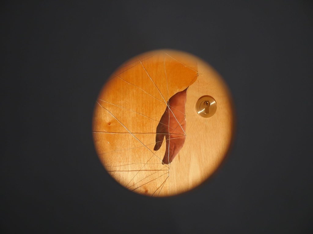
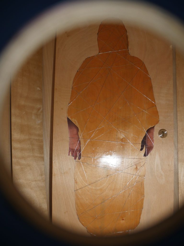
I believe that objects can possess spiritual energy. This umbrella is one of them. It is a Ghanaian Royal Umbrella and made for the kings and Queens. These are not just for shelter from the west African heat but function as symbolism. The artist designs and collaborates with the King/Queen and enriches it with contemporary and specific symbolism. T
The Royal umbrella is handmade with high-grade materials and depicts royal levels to the public.

I was fortunate to find an artist that makes Royal Ceremony umbrellas. The umbrella I have has the spirit of a Queen Mother. It is red with gold fringing. This spirit is present through the experience of building this shrine.

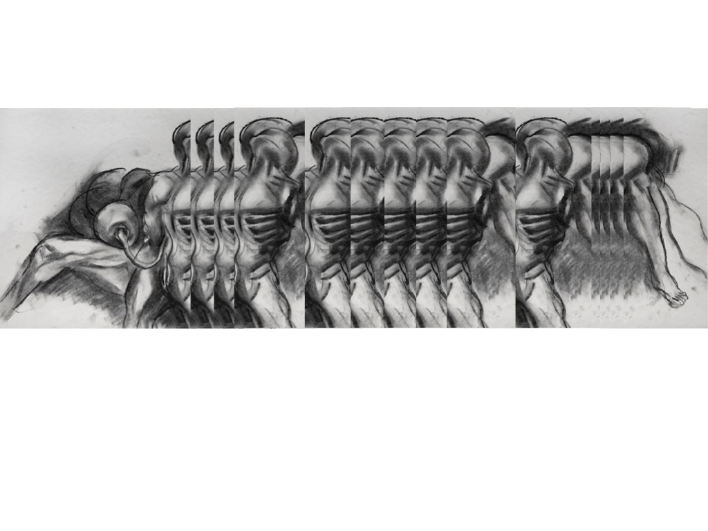
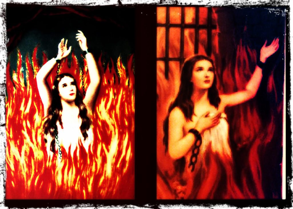
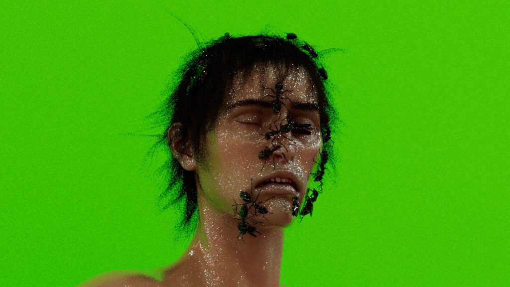
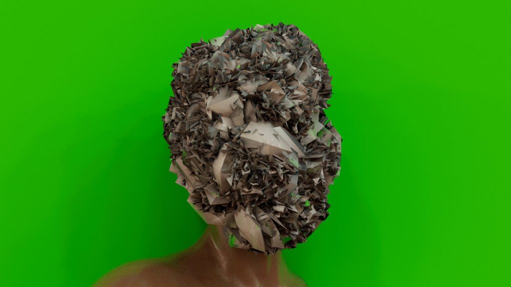
This week I have been changing this umbrella. I am transforming the umbrella into a shrine for the transgender deity I am envisioning. I will share the images at a later stage.

since we here no innocence

continuing to sketch > < continuing to sketch

visible roots left in the ground > < follow up for the tree

tabla tabla strings and vocals >

a call to recent studies >

video description: set to another Lollywood classic, this short clip splits the screen into two separate panels. Each one follows the camera movement from dead roots laid in the grass upward to a living tree and then up again to the blue sky – the movement is from grey decay to lush green and blue life. As the intro to the song finishes and the first vocal is about to drop in, the image pauses for a brief moment…two tabla-like images appear side to side. Both are rotating circles with an inner circle of a blackened wood texture, made to appear like the syahi, the central point of the tabla skin. Both rotating circles give the sense of vinyl records being played, with the outer ring on both circles featuring two distinct family images. One is of my two grandfathers sternly sizing each other up. The other is of my grandmother and her best friend sizing up the camera. As the song continues and fades out, the images are taken away by a burning line across the screen.

Radar

A radar visualisation with a neon blue line that scans the field of vision and dots that flash from red to green.

For a new online work, I’m creating a radar visualisation in which each of the dots will be assigned an image and text that reads ‘I AM NOT TARGET PRACTICE’.

The images that I’m hoping to incorporate are of cloud data centres run by AWS, Google, Microsoft, IBM, and Oracle. I took screenshots using imagery from the ESRI satellite and focused on the data centres in Virginia because it has the highest density of such places in the world.

I’m planning on overlaying these images with cloud satellite imagery so the view of them is partially obscured.

(Alt text for image gallery: satellite imagery of data centres, many are angular and white with fans mounted on the roof).

Collated research on the OKO system

OKO is the early warning system

The type of satellite is Upravlyaemy Sputnik Kontinentalny, or US-K.

These form the Kosmos system (which I have also seen spelt Cosmos).

‘The satellites are drum-shaped, 2 metres long with a diameter of 1.7 m. They weigh 1,250 kilograms without fuel and 2,400 kilograms when fully loaded. They have a 350 kg infrared telescope pointing toward Earth, with a 4 m conical sunshield and an instrument bus. The telescope, which is the satellites’ main instrument, is able to detect radiation from ascending missiles.’

Kosmos has a total of 101 satellites launched between 1972 and 2012, according to Wiki.

The last US-K satellite (Kosmos 2469) was launched on 30 September 2010. As of December 2015, the entire OKO programme is being replaced by the new EKS (or Tundra) satellites and the Kupol system.‘Reportedly the Tundra satellites carry also a secure emergency communications payload to be used in case of a nuclear war.’ I think there are six in orbit, with another launching this year. https://space.skyrocket.de/doc_sdat/tundra.htm

The satellites rely on infrared sensors that can directly detect radiation emitted by a missile plume.

An over-the-horizon (OTH) radar, like all radars, detects reflections of electromagnetic signal that it sends in the direction of a target. OTH radars deployed on the Soviet territory were able to detect missile launches on the territory of the United States by using reflections of electromagnetic impulses from Earth’s ionosphere.

The system began limited operations in 1978 and was placed on combat duty in 1982 (so it was very new when the 1983 incident occurred).

The bunker in Serpukhov-15 includes antennas to communicate with the satellites.

Launches of early-warning satellites into highly elliptical orbits are performed by Molniya-M launchers from the Plesetsk launch site in northern Russia.

An amazing website for tracking satellites http://www.satflare.com/home.asp

The full list of satellites in the Kosmos system https://space.skyrocket.de/doc_sdat/us-k.htm

Related artworks: The Time Before The Fire by Nye Thompson

Vanguard 1, the oldest artificial satellite still in orbit around the Earth
Vanguard 1, the oldest artificial satellite still in orbit around the Earth. Source link below.

Nye Thompson has begun some new research around satellites, especially decommissioned ones, for an online residency with Mostyn Gallery.

This is the summary:

Far above, over our heads a hidden choreography of national and commercial power struggles is playing out. Military, communications, GPS, imaging, monitoring, surveillance – satellites live fast and hard. Existence maintaining baseline performance in the New Frontier is precarious

Alongside them are the ghosts –  thousands of decommissioned siblings that have outlived their usefulness. They will tumble along their graveyard orbits for years or centuries before they hit the atmosphere and burn.’

Nye kindly pointed me in direction of the Kosmos system of satellites which was used in the OKO early warning system I’m researching!

https://mostyn.org/event/the-time-before-the-fire/

https://www.instagram.com/p/Cg1RaZ2DX-T/?utm_source=ig_web_copy_link

Voice Notes

Some Depressing voice notes

I was going to post my voice notes that I made to capture a tone I needed in the work I am making but actually, I dont want to share these with anyone until I am ready so I am not posting them all but Ill post one.

Im using my voice notes to try and process my feelings

IN LIMBO (ELD explored pt2)

Film audio description by Michael Achtman

This piece “IN LIMBO” is the second in a series called “Thought Experiment”, a place in the mind similar to a blank page ready to be painted. Where logic is left behind and I simply put pencil to paper and work off instinct till reoccurring themes seem to show up on the page through imagery, telling me what’s on my subconscious mind. The short film I made that documents the process of creating the artwork began to merge with the artwork as the project went on. As both were trying to figure out what the project was about at its core while simultaneously working on them in real time. Realising both were to do with the relationship between images and words was a revelation. And made me realise what I’ve always hated and loved about trying to explain art is that things always feel left unsaid. As I get older I try and embrace this more, realising that explanations always feel incomplete because I see art as a universal visual language that communicates ideas and emotions which words don’t exist for. This project made me realised that I want my artwork to encourage people to stretch their own creativity, similar to a Spot The Difference or Where’s Wolly does for children. I enjoy making the viewer read the drawings and try to see how the images relate and connect using their own creativity. Even if that means seeing interpretations that I didn’t initially mean to be there.

African Cosmology

“Mapping the Universe.”

This chapter had graphs and images to show the Bantu Congo understood the creation of the Universe, the function of rituals for creating balance and how medicines(Nkisi) take care of the human being and its surroundings.

The “V” of life inspired how I could be the manifest and control the planes of existence. With this control, I have the spiritual power to create a universe. This is a universe for a transgender deity and the function of being a vessel for transformation.

Wargames: the film (1983)

Film still: Wargames, film (1983)

Made in the same year as the Serpukhov-15 incident, Wargames was a film that speculated on the beginnings of accidental war, automated weapons and hackable military facilities.  The plot focuses on a high school teenager who discovers a backdoor into the computer that controls America’s nuclear weapons. Thinking it can’t possibly be a real military computer, the teenager at first thinks he’s playing a computer game, unable to comprehend the enormity of global violence now at his fingertips.

The computer itself was designed to replace human workers (those in power don’t want moral judgements and ethics to stand in the way) so it begins to play the ‘game’ back. And once it starts, it won’t stop.

The film’s tagline is ‘the only winning move is not to play’. Against the background of my research interests, it’s reminding me of something I read in Carissa Veliz’s book Privacy is Power: ‘the internet does not allow you to remain silent’ (p230). It is incredibly difficult to opt out of systems of surveillance and networks that amass data for ‘algorithms of oppression’, to borrow a phrase from Safiya Umoja Noble.

The technologies of such systems of control rely on our inputs, which is why the issue of choice is so pertinent.

In the film, choice was looked at through the lens of computer automated weaponry.

Finally, in Wargames, to stop the computer and to avert catastrophic destruction, they have to convince it that continuation is futile. The competitive cycle of input and response must stop. There are no winners in nuclear war.

I’m wondering what I can take away from this in relation to my research. Maybe it’s that there are no winners when huge amounts of the population are criminalised, subjected to limited opportunities, and marginalised and discriminated against by opaque computerised processes.

Clouds and surveillance

A series of images made by combining maps that show surveillance network Five Eyes locations in the UK and cloud optical thickness.

A satellite image plus patches of orange, yellow, blue, purple and green to show cloud density
UK: Five Eyes locations plus cloud optical thickness
More Five Eyes locations plus cloud optical thickness

The icon of the red triangle with the eye within it was the default setting in the tool I used to create these images. Note: to change in future.

Gillian Wise, Russian Constructivism & Gants Hill station

This is an image of an artwork called Colour Quarter by Gillian Wise produced in 1963. It is a square metal piece with four smaller coloured squares within in. A soft red, a brown-black, an almost turquoise green and an orange. The work has an industrial feel mixed with a playful style.

I am currently researching into artists from Ilford. (Ilford is one answer to where I’m from)

Gillian Wise was a British visual artist born in Ilford. She was part of the English Constructivist movement of the 1950s before becoming a key member of the Systems group.

“Her work follows the principles of experimentation and reduction to elemental units (line, colour, and plane). Her structures play on the effects of the geometry of light and industrial materials, as well as contrasts between transparency and the primary colours.” – aware

This is a black and white image of an artwork by Gillian Wise called Expanding Revolving Line: XRL produced in 1965. It shows two large rectangular pieces, laid over each other with a few centimeters between. The outer is a glass grid that further holds a square metal sheet. Within the square metal sheet, smaller metal squares are lifted onto the surface giving the work a three-dimensional quality. The work is stark and simple, seeming at times like a game but potentially also like a map.


Gillian Wise was born in Ilford in 1936. She grew up in Ilford until leaving the area to study at 18 in Wimbledon. She exhibited as part of the British constructivists and became their youngest member in 1961. She challenged the predominance of American modernism at the time and then continuously throughout her career. She clearly understood art and artistic production to be an overtly political matter and spoke often about the CIA intervention in Cold War cultural production.

From her book, Low Frequency:

“There artists of all stripes and their nascent agents had to be American to get the full treatment of nurture and sponsorship since that is what policy demanded. Policy from Washington. Out of this was born the Abstract Expressionist group… the two names which have been retained as most representing that moment are Pollock and Rothko, although the latter was trying for a stylistic variant. While Pollock reflects some early Alexander Rodchenko (one of the original and prolific members of the Russian Constructivist movement) experiments, Rothko’s attempt at mysticism, à la Malevich, is a very thin affair.”

Her work was overtly political and she herself was an avowed Leftist who won a British Council scholarship to research Russian constructivism in 1969. She travelled to Leningrad, exhibited in Helsinki and joined the Systems group, a collection of Marxist artists who successfully produced and showed work throughout the 70s.

This is an image of a work by Gillian Wise called Looped Network Suspended in Pictorial Space from 1974. It is acrylic on plastic and contains a central geometric form made of blue red and green lines on a creme background. It gives the impression of string and the sense of flexibility despite all of the lines being perfectly angular.
This is an image of the work Opening Movement by Gillian Wise produced in 1976. It is a painting on paper with acrylic. The background of the image is split horizontally with the lower half painted grey and the upper half creme. In the foreground is an abstract image made of four tilted grey squares descending downward. Connecting them at an odd angle is a blue and red frame. It is as if the simple framed square is springing upward off of its flat back.


Gillian Wise was the only British artist to create work for the opening of the Barbican centre in 1982. Her work, the Alice Walls, inspired by the Russian avant-garde, remained entirely uncredited until 2014. She referenced it as, “a dark episode in the annals of support for national artists and, of course, women.”

The history of this Ilford-born artist gives so much rich context to the sidelining of genuinely Leftist and Marxist positions throughout the Cold War. It also references the definite and unacceptable misogyny of the mainstream British art establishment who have since begun to rewrite their silence around Gillian Wise with her inclusion in a variety of shows.

While on the surface it seems that Ilford plays a limited or invisible role in the artists history, one striking historical coincidence keeps me wondering.

This is an image of Gants Hill train station showing the central concourse. It shows a creme-coloured vaulted ceiling with a row of benches through the middle where some commuters are sitting. At the end of the shot, small but visible in the distance are the escalators going upward. The station is lit by a row of tall upturned lamps across the cental line of benches. The photograph is beautifully symmetrical, except for the commuters who predominantly face the platform leading into central London.
Gants Hill Underground Station in Ilford


In 1937, one year after Gillian Wise was born, construction on the Gants Hill underground station in Ilford began. The station was designed by Charles Holden and was inspired by stations on the Moscow Metro.

Before it was eventually opened to the public in 1947, the ‘under construction’ station was used as an air-raid shelter. After consultation between Moscow and London about the building of the Moscow Metro in the 1930s, British architects returned to London with some new ideas. Gants Hill is designed with a central vaulted concourse separating two platforms in order to maximise the amount of space for the flow of people.

Getting to the platform level of the station is a striking experience. As you travel down the deeply-set downward steps the square floor tiles slowly come into view before the marvel of the ceiling is revealed. The station has barrel-vaulted ceilings and is tiled in a geometric pattern that is reminiscent of the Krasnye Vorota Metro station in Moscow which opened in 1935.

This image is a photograph of Krasnye Vorota Metro Station. It shows a creme-coloured vaulted ceiling with tiled walls. It bears a striking similarity to Gants Hill station in London. In a small difference between the two, this image shows orb-like lights hang from the ceiling. The platform is empty of people and the angle of the photograph emphasizes how barrel-shaped the station design is.
Krasnye Vorota Metro Station


Ivan Fomin was the designer of the Krasnye Vorota Metro Station. Fomin worked in a variety of styles throughout his lifetime, including Art Nouveau, Neoclassicism and an intermediary style of architecture known as Postconstructivism.

By the early 1930s, Constructivist art and architecture had fallen out of favour and was soon to be replaced. Stalinist architecture would become the dominant form of expression for the next decades. Wedged in between these two larger forms is a brief architectural style known as Postconstructivism (sometimes referred to as early Stalinism).

Constructivist work had been wildly imaginative and avant-garde in its use of shapes, materials and technology. It was avowedly political, aiming to incite a social purpose for all people in public spaces. The demise of Constructivism comes alongside the rise of Stalin and the impact of centralised state power. The Stalinist architecture that followed utilized classical forms representing a return to traditional notions of power. Dmitry Khmelnitsky writing about this period suggested that Constructivism was ended by the force of Stalinist power. Khmelnitsky suggests that “traces of the Constructivist style in the Postconstructivism of the 1930s are a sign of indecision, not tradition.” There was a vacuum that state-sponsored artists were filling with a combination of what came before (Constructvisim) and even further back (Classicicism). This combination of ideas was the starting point for Stalinist architecture. Postconstructivism is truly then a misnomer for the return of classicist forms and styles with accidental traces of Constructivism.

Ivan Fomin himself had a deep love for classicism and had spent a long time attempting to develop his own form of proletarian classcisim. In the 1930s he partook in key competitions to design the Moscow Metro. He won just one and designed the station Krasnye Vorota with vaulted ceilings and a central concourse. A model of the station was at the 1938 World’s Fair in Paris where it won the Grand Prix. Fomin designed the station in what would become called Postconstructivism.

This is a black and white image of an architects sketch. It shows an exaggerated and large imagination of what a station could be. It shows an enormous vaulted high-ceiling in tiled segments. Each segment meets the ground with a clump of four neo-classic style columns. The sketch shows some people but its main feature is its rounded ceiling.
Ivan Formin competition entry for a Moscow Metro


Gants Hill station in Ilford, designed by Charles Holden adapted from a design by Ivan Fomin, bares the scars of the Constructivist movement being clamped down on by the Stalinist regime.

Gillian Wise, born in Ilford, developed a career as an artist inspired by Russian constructivist art. She would even travel on a British government grant to research Russian constructivism in the country itself.

Only after this trip to Russia does Wise give up being a Constructivist artist and move on to join the Systems group.

I’m not saying that architectural ghosts haunted Gillian Wise as a child until she was able to exorcise them in the country from which they originated but…I am saying that.

Anointed Garments

As a way of communicating and accessing divine vitality, anointed Garments become a token, and their symbolism is vital to the experience of creating rituals. It is not only representation but the surface/platform for the divine to be present within the fabric and in this plane. These garments facilitate becoming a vessel for the creation of a brand new universe.

How do I create an anointed garment? Colour is key. Colour communicates various meanings in this process, white is the colour of the garment I am creating. White represents innocence, purity, light and authority. Creating anointed garments requires personal cleansing rituals, prayer/meditation, and the offering of self. As part of this residency, I will become the mediator for a transgender deity, and white is the colour called forth.

I began the process with a collaborator to design and create a garment for the mediator/vessel here on earth. These are the current sketches of the garment. Upon completion, it will be offered to the deity and prayed for.

This Valentino show served as a form of inspiration. These Garments are other worldly. I enjoyed watching this show.

Disappearing forests

How can a forest disappear without any trees being cut down? Here are two images showing the same region, the Uinatas mountain range, that show how something can disappear in an instance in satellite-assisted visualisations.

Researchers show that 6% of global forests – equivalent to the size of China – disappear when you define a forest by 10% tree cover instead of 30%. Tree cover describes the density of trees in an area and is used to produce forest/non-forest maps which the researchers say are causing issues.

I started looking at forests because the Serpekov-15 bunker is an area of Russian forest, and this finding relates to my interest in the discrepancies within computer-assisted, data-driven vision. From one perspective, there is a forest. From another, there isn’t.

We might be physically present in that forest and yet it wouldn’t exist.

https://earthobservatory.nasa.gov/images/86986/is-that-a-forest-that-depends-on-how-you-define-it

https://earthobservatory.nasa.gov/images/87176/when-a-definition-makes-a-forest-disappear

Clouds and control

This week I’ve been experimenting with layering up cloud imagery and the control dashboards used within missile control centres.

I’d been thinking about the false premise that more data guarantees more clarity, something that James Bridle talks about in his book New Dark Age. It’s a premise often used to bolster the perpetuation of surveillance technologies. But as Bridle alludes to, more data also means greater complexity and increased potential for confusion and comprehension. It is an uneasy paradox that destabilises the idea that more data enables us to see more clearly, when the reality is more cloudiness.

We have likely heard or experienced the temptations of the ‘big red button’ – do not press, urging us to do the opposite. But I’ve also been thinking that even the existence of a button sets the stage for the following events. It is there so the temptation is to use it (this is one of the ongoing arguments against the likes of Trident). So my experiments this week also looked at the aesthetics of disappearing dashboard controls, blurring into this clouded vision.

The images of dashboards are released under a Creative Commons license by photographer Todd Lapin and show the control panels within SF-88, a former Nike missile base in the Marin Headlands, US. Nike missiles were anti-aircraft missiles often equipped with nuclear weapons between the 1950s and 1970s during the Cold War. Here is a link to the Creative Commons license: https://creativecommons.org/licenses/by-nc/2.0/

The cloud videos are from a dataset created by the Multimodal Vision Research Laboratory (credit below) and also feature videos collected by Martin Setvak.

Cloud dataset credits: Jacobs N, Abrams A, Pless R. 2013. Two Cloud-Based Cues for Estimating Scene Structure and Camera Calibration. IEEE Transactions on Pattern Analysis and Machine Intelligence (PAMI) 35:2526–2538. DOI: 10.1109/TPAMI.2013.55, and Jacobs N, Bies B, Pless R. 2010. Using Cloud Shadows to Infer Scene Structure and Camera Calibration. In: IEEE Conference on Computer Vision and Pattern Recognition (CVPR). 1102–1109. DOI: 10.1109/CVPR.2010.5540093.

i can flow with the feeling of the water

this work is a quick sketch >

it’s a rough work based on recent research >

< it also uses previous studies

the footage is taken from one mountain spring in the Harz >

suddenly any place where the water flows is a place I can imbibe with a sense of home/belonging >

bodies of water as liminal spots of belonging >

this work draws its title from lyrics in Mark of my Departure >

it is meant tobe funny >

video description: set to a classic Lollywood tune this video juxtaposes different images of flowing water in different shaped frames. The frames are sometimes overlapping, sometimes slowly elongating and are synchronised to reflect moments in the musical journey. The water is flowing from a small stream across grey-brown rocks flanked by some greenery and soft moss. The water is clear and the flow is strong.

As the beat drops and the tabla comes into full swing, two circular images are seen rotating on the screen. The two images are in the same style and both created in the same way. On the left is an image of my grandfather, reading a newspaper, looking away from the camera. His image is framed by a circular photograph of a chopped tree trunk. Using the same method, the image on the right has the chopped tree trunk frame with an image of my father and his brothers in it, all sporting the wild 1970s style of facial and head hair. The two images rotate continuously in the style of old vinyl before slowly fading out.

the tabla and dislocation pt. 3

more studies in chopping the tabla

An old circular photograph shows two stern, old brown men, in their 50s, both wearing glasses sizing each other up. Both are suited looking smart and they are both grandfathers of the artist. Obscuring the centre of the image is a perfect circle. It is filled with the texture of a chopped tree trunk but blackened to approximate the Syahi, the centerpoint of the tabla.

these are my two grandfathers surveying each other

This circular photograph contains the image of two 'almost smiling' women, looking softly at the camera with a lightness but strength of purpose.  It is the artists grandmother and her best friend. Obscuring the center of the image is a circle filled with the texture of a chopped texture but blackened to approximate the Syahi, the centerpoint of the tabla.

my grandmother and her best friend

MADE THE SYAHI

Using the image of the chopped down tree stumps, I fashioned the syahi for these tabla’d images, making the symbol of dislocation the central point of attention. Reversing the process from the previous studies, trying to be more direct in the tabla reference and combing through the family pictures. This process has reminded me that so much of this work is about building an archive for/of the family that reconnects the ancestral lineage severed by dislocation.

OKO: the eye and Molniya orbits

Image credit: Groundtrack of a Molniya orbit.  By Hartze1 – Public Domain

It was the OKO satellites connected with the Soviet M-10 supercomputer that mistakenly identified sunlight on clouds as the movement of nuclear missiles (OKO being the Russian word for ‘eye’). They detect infrared radiation which is then used to interpret the trajectory of missiles from the heat of their exhausts.

The OKO satellites moved on elliptical Molniya orbits of which there are some nice visualisations on the Wiki page.

Molniya translates as Lightening in Russian and this type of orbit has been used for telecommunications, TV broadcasting, and weather monitoring as well as in the military early warning systems I’m looking at.

Animation of EKS orbit around Earth - polar view Animation of EKS orbit - ECEF - front view Animation of EKS orbit around Earth Animation of EKS orbit - ECEF