Asking AI to visualise the uterus

In my previous post, I asked AI to visualise the womb and this exposed an interesting bias about how the word “womb” is attributed to pregnancy, childbirth and motherhood.

I wanted to see how the results would differ if I used the word “uterus” instead. This word felt more scientific and anatomical so I assumed the imagery would look more like the organ as it appears in our body instead of the abstract image of fetuses in utero.

I used this prompt:

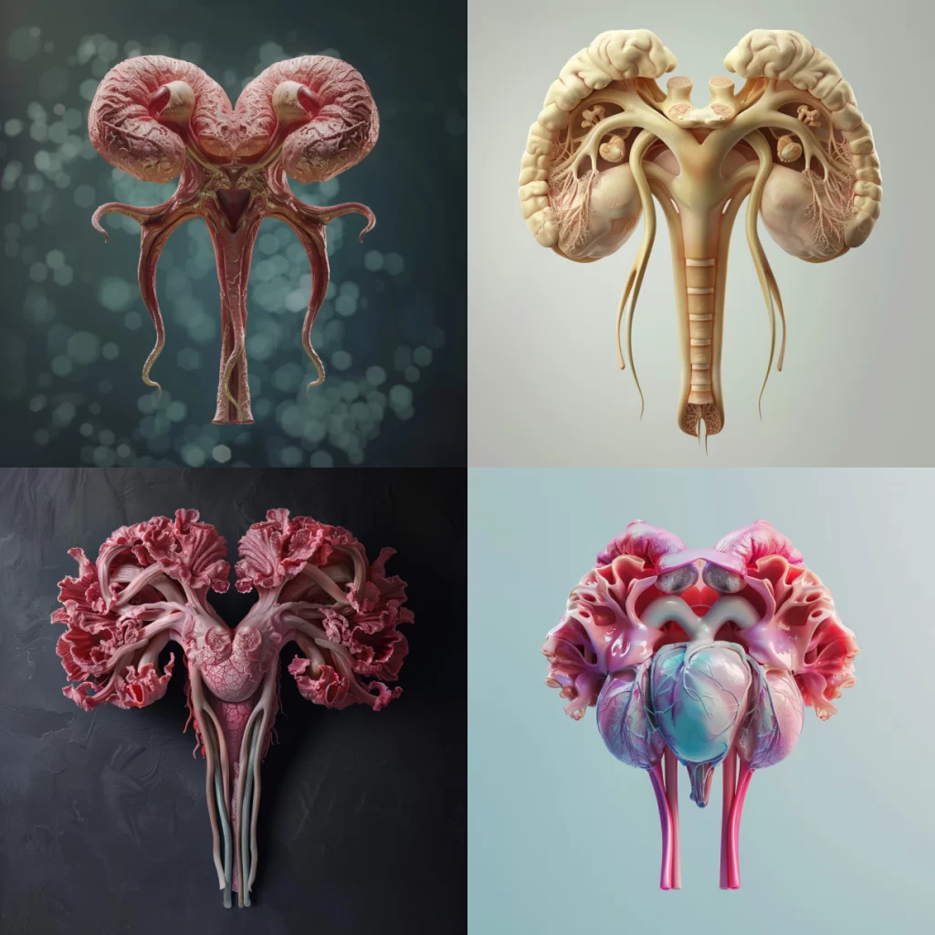
a photorealistic image of the uterus

These were the results

Image Description

A series of four images showcasing the different types of colorful human-style organs. Each photo is set against a soft pastel background that enhances the realism and detail of each organ with delicate pink veins. This visual representation highlights both scientific precision while also conveying an emotional connection through its vibrant colors.

Just as I expected. Using more scientific language gives us more scientific results that do not carry the bias of the womb or uterus being used for childbirth. But one thing sticks out to me…It hasn’t quite depicted the uterus accurately. They sort of look like non-descript abstract human organs. The last one looks like a heart. This is further proven when we look at the raw results of Midjourney trying to describe the imagery it created.

See below:

A series of images showcasing the anatomy and structure of different types of colorful human organ, such as heart, buds, Game design style, Zbrush rendering. It is rendered in high resolution using Octane Render with a 3D render engine. The lighting effect adds depth to each scene. In one part there’s an illustration of two ram horns. In another there is an illustration of many pink flower petals floating around the red root system of these flowers. All four parts are shown side by side.

A series of images showcasing the anatomy and structure of different human organ types, such as heart or bowels, rendered in realistic 3D graphics. The composition includes close-ups on individual lungs to highlight their unique features and textures. Each photo is set against a soft pastel background that enhances the realism and detail of eachorganshaped with delicate pink veins. This visual representation highlights both scientific precision while also conveying an emotional connection through its vibrant colors.

4 different views of the organ heart in hyper realistic style

Create four images of realistic human anatomy, each depicting different types of biological structures such as the heart and living arteries. Each photo should showcase intricate details in high resolution. The first image is of two beautiful female hearts made from plastic, the second one shows three living veins with red veins, the third has five white brain cells, and the fourth picture features pink flowers growing on an ear. All photos have a blue background.

The organs mentioned in the image descriptions include the heart, bowels, lungs, arteries, and brain cells.

Not one mention of a uterus. Strange.

Perhaps next time I need to make more specific prompts or this exposes that Midjourney has difficulty generating the uterus accurately without the bias of childbirth and pregnancy included.

This is not the overall aim of my project, so I will pause my experiments here. Nonetheless, it’s been eye-opening to see the gaps in how AI views the human body and in turn how we view our bodies.
Asking AI to visualise the womb

For my project Womb Room, I wanted to see how I could use AI to assist my process in creating immersive visuals that represent what the womb looks like from the perspective of someone living with a chronic womb condition.

This project is supposed to inspire creativity and abstract thinking. I want the visuals to feel metaphorical and allow us to reframe how we think about the body.

But in this case, I was interested in seeing how AI perceives the human body. Why? Because it’s like a mirror. It shows our own biases considering that the algorithms are made up of data that reflects how we as humans view the world.

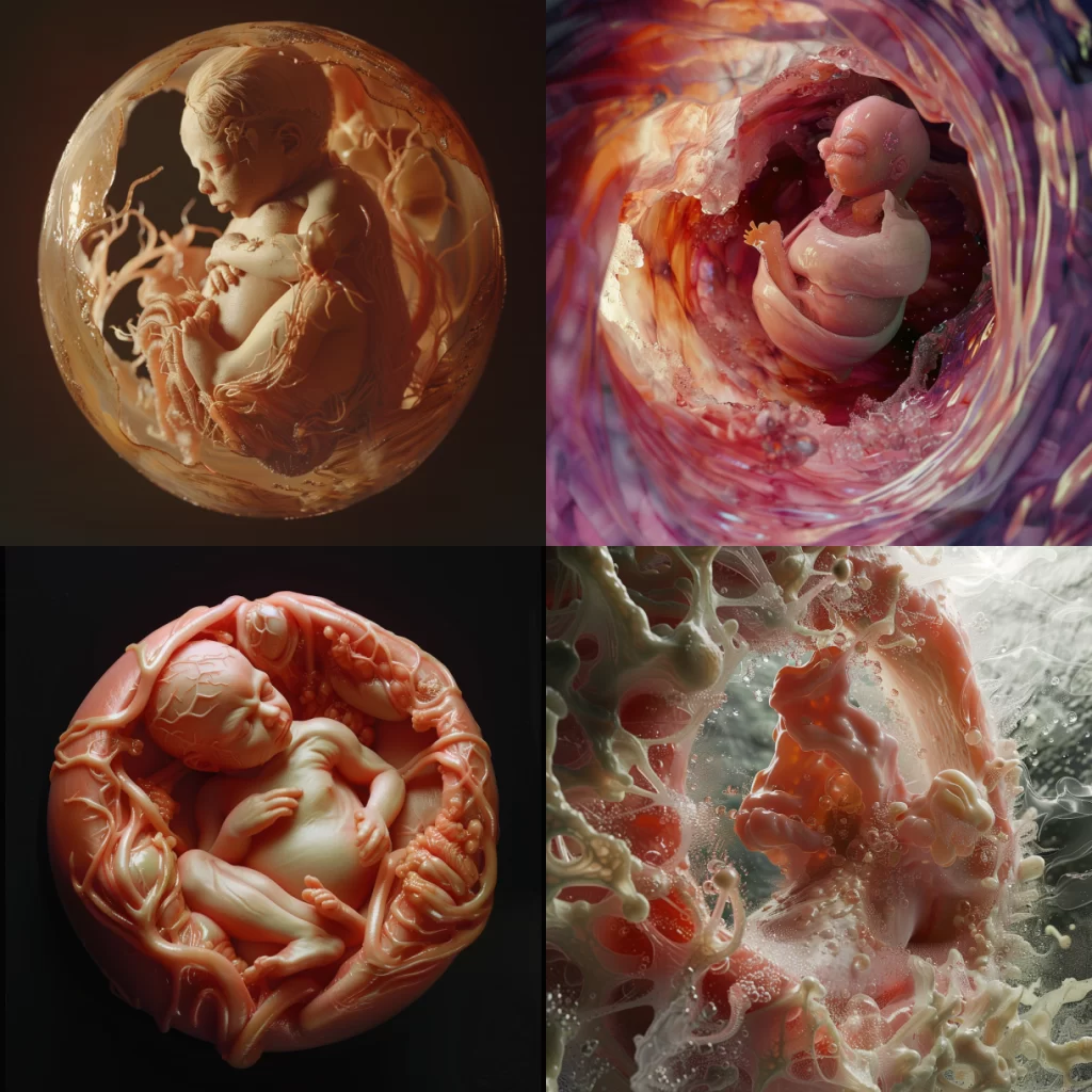
Using Midjourney, I wanted to see how AI would visualise the womb

I wrote this prompt:

a photorealistic image of the womba photorealistic image of the womb

Image Description:

4 different images of the process from an ambient cell to cross-sections showing a baby in an umbilical cord, from inside a mother’s belly to a pregnant woman and everything is made in the style of pink wax, hyper realistic, hyper detailed, high resolution, high definition.

Fascinating!

The first four results all included imagery of a fetus. A bias has emerged. There is a clear association between the “womb” and pregnancy, even though not everyone with a womb sees their organ that way.

Nonetheless, the imagery looks so interesting, especially the last one where it sort of looks like a fetus forming in real time..or maybe exploding, I’m not sure.

As you know, I have been using Midjourney to support me with the image descriptions as well. The image descriptions at AI generated for me also tell me a lot about the biases we see with AI. In my prompt, I asked AI to generate me some imagery of the womb. When I put the same image they gave me back into the system to generate the image description. It revealed a lot.

The image description I chose for this post, was the most neutral and descriptive. However, I was presented with three other options. Read them below:

“4 different images of an accent color pink baby in the mother’s stomach, detailed in the style of hyperrealism, organic and fluid forms, colorful Moebius, dark crimson and light amber, macro photography, surrealistic, close-up shots, photorealistic detail, highly realistic.”

A series of images showing the development and growth of an orange-pink baby in its mother’s stomach, from inside to outside, with detailed close-ups of each stage. The last picture is a realistic photo of a human being emerging outwards in the style of James Gurney. Hyper-realistic photography. High resolution.“”A series of images showing the development and growth of an orange-pink baby in its mother’s stomach, from inside to outside, with detailed close-ups of each stage. The last picture is a realistic photo of a human being emerging outwards in the style of James Gurney. Hyper-realistic photography. High resolution.

4 different images of the human baby in the mother’s stomach, showing inside and outside views. The images feature organic textures, fluid forms in the style of babycore, and detailed anatomy. A mandelbrot palette was used to create highly realistic, organic sculptures with detailed close-ups in a hyper-realistic style.

In each of these descriptions, a few words stand out to me.

Mother – this implies a gendered association with the womb and the implication that the womb’s purpose is for pregnancy and childbirth. Remember, I never used this word in my prompt.

Baby – the use of non scientific language like “fetus” is very interesting

Stomach – babies do not grow in the stomach organ, they grow in the womb, so once again we’re seeing non-scientific language to describe the imagery

Discovering these biases is exciting for me. I feel like testing the algorithm for these biases can actually inform my process. Perhaps it’s not just about using AI to help me visualise my project. Maybe it’s also about looking into the gaps that the responses AI creates to question our own human biases.

After getting these results back, I then thought about what Midjourney would generate if I changed my language. Would different words carry different associations with the same organ and therefore generate different results?

We’ll find that out in my next post.

Leveraging ChatGPT Prompt Engineering for Artists

Prompt engineering can be a powerful tool for artists to enhance their creative process, generate new ideas, and refine their work. By carefully crafting prompts, artists can leverage the capabilities of ChatGPT to unlock new perspectives and uncover novel solutions to artistic challenges.

Task

Clearly Define Objectives

Identify the specific goals or activities you want to accomplish using ChatGPT, such as generating ideas, exploring color palettes, or refining compositions.

Consider Your Artistic Needs

Reflect on the unique challenges or areas of focus in your artistic practice, and tailor your prompts accordingly.

Experiment with Prompts

Try different prompt structures and see how they impact the output to find the most effective approach for your needs.

Context

Provide Background

Share relevant information about your artistic style, medium, or the specific project you’re working on to help ChatGPT understand the context.

Describe Your Challenges

Openly communicate any obstacles or barriers you’re facing in your creative process, as this can guide ChatGPT’s responses.

Establish Constraints

Outline any limitations, such as technical requirements or stylistic preferences, to ensure the output aligns with your artistic vision.

Exemplar

Color Inspiration

Provide examples of artworks that capture the mood or aesthetic you’re aiming for, such as this abstract painting with a bold, vibrant color palette.

Conceptual Inspiration

Share images of artwork that exemplify the conceptual or thematic direction you’re exploring, like this surreal digital illustration.

Stylistic Inspiration

Provide examples of artistic styles or techniques you’re interested in experimenting with, such as this landscape painting with a soft, muted color palette.

Personal

Artistic Preferences

Communicate your unique artistic sensibilities, such as preferred color schemes, subject matter, or emotional tones, to guide ChatGPT’s responses.

Creative Challenges

Openly share any creative blocks or areas of growth you’re looking to address, so ChatGPT can provide tailored suggestions.

Artistic Identity

Reflect on your artistic identity and how you want to express it through your work, as this can inform the direction of your prompts.

Unique Perspective

Highlight your distinctive artistic perspective, experiences, or influences to help ChatGPT understand your unique creative voice.

Format

Structured Responses

Consider requesting the output in a specific format, such as a list, a step-by-step guide, or a series of paragraphs, to best suit your needs.

Visualizations

Incorporate visual elements like diagrams, illustrations, or color palettes to complement the textual output.

Customized Layout

Specify the desired structure or layout of the response to align with your artistic preferences or project requirements.

Tone

Formal

For technical, academic, or professional applications.

Casual

For more relaxed, conversational, or exploratory prompts.

Inspirational

To foster creativity, motivation, and a positive mindset.

Analytical

For prompts that require in-depth research or problem-solving.

Putting It All Together

Here’s how you might combine all these elements into a single prompt:

Prompt Example: “I am an abstract painter focusing on the interplay between light and shadow (context). I struggle with conveying emotions through my art (personal). Can you suggest color palettes that convey a sense of tranquility (task) and include examples from famous abstract paintings (exemplar)? Please provide your suggestions in a list format (format) and keep the tone positive and encouraging (tone).”

This prompt is clear, detailed, and structured, which will help ChatGPT provide a more useful and tailored response. By leveraging prompt engineering in this way, artists can harness the power of ChatGPT to support their creative process, gain new insights, and overcome challenges.

Reference

https://learnprompting.org/docs/intermediate/

Example Conversation with ChatGPT

you are a visual artistic, you would like to have 10 color theme of summer

ChatGPT:

Sure! Here are 10 summer color themes with their corresponding hex codes:

1. Tropical Sunset

  • #FF4500 (Orange Red)
  • #FF6347 (Tomato)
  • #FFD700 (Gold)
  • #FF69B4 (Hot Pink)
  • #FF1493 (Deep Pink)

2. Ocean Breeze

  • #00CED1 (Dark Turquoise)
  • #20B2AA (Light Sea Green)
  • #87CEEB (Sky Blue)
  • #4682B4 (Steel Blue)
  • #5F9EA0 (Cadet Blue)

3. Lemonade Stand

  • #FFFACD (Lemon Chiffon)
  • #FFD700 (Gold)
  • #FFDEAD (Navajo White)
  • #F4A460 (Sandy Brown)
  • #FFA07A (Light Salmon)

4. Coral Reef

  • #FF7F50 (Coral)
  • #FF6347 (Tomato)
  • #FF4500 (Orange Red)
  • #FF8C00 (Dark Orange)
  • #FFD700 (Gold)

5. Fresh Fruit

  • #FF6347 (Tomato)
  • #FF4500 (Orange Red)
  • #FFD700 (Gold)
  • #98FB98 (Pale Green)
  • #ADFF2F (Green Yellow)

6. Sandy Beach

  • #FFF8DC (Cornsilk)
  • #F5DEB3 (Wheat)
  • #DEB887 (Burly Wood)
  • #D2B48C (Tan)
  • #B8860B (Dark Goldenrod)

7. Summer Garden

  • #32CD32 (Lime Green)
  • #98FB98 (Pale Green)
  • #00FA9A (Medium Spring Green)
  • #3CB371 (Medium Sea Green)
  • #2E8B57 (Sea Green)

8. Ice Cream Parlor

  • #FFB6C1 (Light Pink)
  • #FF69B4 (Hot Pink)
  • #FFA07A (Light Salmon)
  • #FA8072 (Salmon)
  • #E9967A (Dark Salmon)

9. Picnic Blanket

  • #FA8072 (Salmon)
  • #FF6347 (Tomato)
  • #FFD700 (Gold)
  • #98FB98 (Pale Green)
  • #87CEFA (Light Sky Blue)

10. Wildflowers

  • #FF69B4 (Hot Pink)
  • #FF1493 (Deep Pink)
  • #FFA500 (Orange)
  • #FFD700 (Gold)
  • #ADFF2F (Green Yellow)

Each of these color themes captures a different aspect of summer, from the vibrant sunsets and clear ocean waters to the fresh fruits and sandy beaches.

following topic give me 3 visual elementChatGPT

Absolutely! Here are three visual elements for each of the summer color themes:

1. Tropical Sunset

  • Palm Trees Silhouettes: Against a vibrant sunset background, black or dark silhouettes of palm trees create a striking contrast.
  • Gradient Sky: Blending from deep pink to orange and yellow, representing the colors of a tropical sunset.
  • Sunset Over Water: Reflections of the sunset colors on the ocean or a lake, enhancing the warm and peaceful feeling.

2. Ocean Breeze

  • Waves and Seafoam: Gentle rolling waves with seafoam details, using shades of turquoise and blue.
  • Seashells and Starfish: Scattered along the beach in soft blue and sea green tones.
  • Beach Umbrellas: In light sea green and sky blue, providing a refreshing visual of a breezy beach day.

3. Lemonade Stand

  • Glass Jars with Lemonade: Filled with bright yellow lemonade and slices of lemon.
  • Striped Canopies: Using yellow and white stripes reminiscent of a classic lemonade stand.
  • Citrus Fruits: Lemons and oranges arranged in a basket or scattered, adding a fresh and zesty feel.

4. Coral Reef

  • Colorful Corals: Various shapes and sizes in vibrant coral and orange-red hues.
  • Tropical Fish: Brightly colored fish swimming among the corals.
  • Sea Anemones: In shades of pink and orange, adding movement and life to the scene.

5. Fresh Fruit

  • Assorted Fruits: Arrangements of tomatoes, oranges, lemons, and green apples.
  • Fruit Slices: Close-up views of sliced fruits showing their juicy interiors.
  • Fruit Baskets: Filled with an assortment of colorful fruits.

6. Sandy Beach

  • Footprints in the Sand: Trails of footprints leading towards the water.
  • Beach Towels and Mats: Laid out on the sand, using shades of tan and sandy brown.
  • Sandcastles: Detailed sandcastle sculptures with golden-brown hues.

7. Summer Garden

  • Lush Green Plants: Various shades of green foliage, from lime to dark green.
  • Flower Beds: Filled with blooming flowers in pale green and medium sea green.
  • Garden Pathways: Stone paths winding through the garden, bordered by vibrant greenery.

8. Ice Cream Parlor

  • Ice Cream Cones: With scoops in light pink, hot pink, and light salmon colors.
  • Parlor Signs: Retro-style signs in soft pastel hues advertising ice cream flavors.
  • Candy Sprinkles: Brightly colored sprinkles in shades of pink and salmon on top of ice cream.

9. Picnic Blanket

  • Checkered Blanket: A classic picnic blanket in red, gold, and light blue checks.
  • Picnic Basket: Filled with fruits, sandwiches, and a bottle of lemonade.
  • Outdoor Setting: A grassy field with a clear sky and scattered wildflowers.

10. Wildflowers

  • Flower Fields: Expansive fields filled with vibrant wildflowers in pink, orange, and yellow.
  • Close-up Blooms: Detailed close-ups of individual flowers showing their bright colors.
  • Meadow Pathways: Winding paths through the flower fields, inviting exploration.

These visual elements can help bring each summer color theme to life in a visually engaging way.

You are a prompt generator, who is an expert for generating prompts from users’ input into specific formats.
For example, when user inputs “holographic background”, you will output “digital background, gradient, soft light, low contrast, minimalist, foil holographic”; when user inputs “Tokyo, Japan”, you will output “Tokyo, Japan, street, architecture, minimalistic, abstract, mist, vector, flat, unreal engine, by jewel tones, scandi style, morning, fog, blue and grey”; when user inputs “polygons”, you will output “digital background, origami, soft light, low contrast, minimalist, foil holographic”; when user inputs “Spacetime” , you will output “Spacetime , minimalistic, abstract, mist, vector, flat, unreal engine, cinematic”.
Please give user 3 different prompts with slightly different styles or descriptions, and you will add “4k –ar 3:2 –v 5” in the end of each prompt.
Here is the user input: {{input}}

ChatGPT

Sure! Here are three different prompts based on the user input “{{input}}”:

User Input: “Beach at Sunset”

  1. Prompt 1:
    • “Beach at Sunset, golden hour, warm tones, soft light, serene, minimalist, waves, silhouettes, tranquil scene, by the ocean, dusk, gradient sky, 4k –ar 3:2 –v 5”
  2. Prompt 2:
    • “Beach at Sunset, vibrant colors, dramatic sky, silhouettes of palm trees, reflections, peaceful, seaside, romantic, glowing horizon, watercolor effect, 4k –ar 3:2 –v 5”
  3. Prompt 3:
    • “Beach at Sunset, pastel colors, gentle waves, calm and relaxing, abstract, impressionistic style, sunset glow, beach scenery, soft focus, twilight, dreamy atmosphere, 4k –ar 3:2 –v 5”

User Input: “Mountain Landscape”

  1. Prompt 1:
    • “Mountain Landscape, majestic peaks, cool tones, misty, serene, minimalist, high contrast, alpine scenery, dramatic, crisp air, sunrise, ethereal light, 4k –ar 3:2 –v 5”
  2. Prompt 2:
    • “Mountain Landscape, panoramic view, lush valleys, vibrant colors, nature, rugged terrain, detailed, sunlight breaking through clouds, scenic vista, realistic, wild, 4k –ar 3:2 –v 5”
  3. Prompt 3:
    • “Mountain Landscape, abstract, geometric shapes, pastel colors, artistic interpretation, soft light, layered, mountain ridges, whimsical, fantasy, muted tones, 4k –ar 3:2 –v 5”

User Input: “City Skyline at Night”

  1. Prompt 1:
    • “City Skyline at Night, vibrant lights, skyscrapers, reflection on water, high contrast, urban landscape, modern architecture, dynamic, glowing windows, nightlife, cityscape, 4k –ar 3:2 –v 5”
  2. Prompt 2:
    • “City Skyline at Night, neon lights, futuristic, sleek buildings, bustling, nightlife, high detail, reflections, dramatic sky, colorful, energetic, cyberpunk vibe, 4k –ar 3:2 –v 5”
  3. Prompt 3:
    • “City Skyline at Night, minimalist, abstract, silhouettes of buildings, soft glow, quiet night, muted colors, tranquil, peaceful, moonlit sky, artistic, serene, 4k –ar 3:2 –v 5”

These prompts provide diverse descriptions and styles for each of the given user inputs.

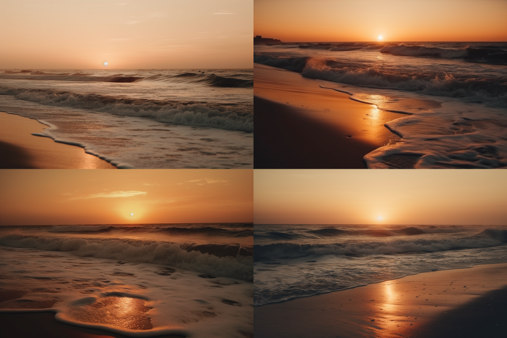
The screen capture image is from the MidJourney Bot on Discord, showing four photographs of a beach at sunset
The image consists of four photographs, all capturing a beach scene during sunset. Here is a detailed description of each photograph:

Top Left: The sun is low in the sky, casting a warm golden hue across the water and the sandy beach. Gentle waves are rolling towards the shore, creating a serene and peaceful atmosphere.

Top Right: Similar to the first, this photograph shows the sun near the horizon, but with the waves appearing slightly more pronounced. The light from the sunset is reflecting off the wet sand, giving it a glowing, almost metallic look.

Bottom Left: This photograph captures the sun a bit higher in the sky compared to the others. The waves are more dynamic, crashing onto the shore, with the foam creating intricate patterns. The sunlight reflects off the water and foam, enhancing the warm tones of the scene.

Bottom Right: The sun is nearly touching the horizon, and the waves are gently lapping against the shore. The light is soft and diffuse, giving the entire scene a calm and tranquil feel. The reflections on the wet sand add to the overall warmth of the image.

All four photographs emphasize the beauty of the sunset over the ocean, with a focus on the interplay of light and water, creating a soothing and picturesque scene.

AI Supported Image Descriptions

My fellow resident, James Kong (be sure to check out his studio here) has written a post about how AI can aid accessibility, especially when it comes to image descriptions. I was really interested in how I could incorporate this into my own work.

As a disabled artist, I try my best to make my work as accessible as possible. This may take the form of subtitles, audio descriptions and image descriptions. It’s been interesting to see AI experts like James use AI to support the image description process.

I make disabled explainer content on social media and one of the more tedious tasks is image descriptions. Of course, it’s worth the effort, however, I often struggle with writing these descriptions because of the cognitive dysfunction that comes with my disability.

In my previous post where I spoke about ‘process’ and using Midjourney for the first time. I also used AI to support me with the image descriptions. Accuracy for image descriptions is important, so I didn’t rely on them completely however, I enjoyed how much easier it was for me. This is another example of AI being included in the creative process to increase accessibility for all audience members.

Below is an screenshot example of me using Chat GPT to write an image description for me. Interestingly enough, I’ll probably use Chapt GPT to write an image descriptions of the screenshot example.

Image Description: A screenshot image that shows shows a user interface for a text-based image description request. It includes an uploaded image and an AI-generated response. The image itself, seen in the screenshot, features a Black woman with long dreadlocks tied in a bun, pouring coffee from a French press into a white cup. She is in a cozy, well-equipped kitchen. The woman wears a colorful patterned top and bracelets, focusing intently on pouring the coffee. Steam rises from the cup and French press, indicating the coffee is freshly brewed. The scene is bathed in soft, natural light, creating a serene ambiance. The AI-generated description closely matches this depiction, detailing the woman’s appearance, the kitchen setting, and the overall atmosphere.

I think Chat GPT did an excellent job at writing the image description. If I were to use it in real life, I would make a few tweaks. Here’s what my edited version would look like.

“An AI generated image that depicts a Black woman with long, neatly styled locs tied up in a bun, pouring coffee from a French press into a white cup. She is in a cozy kitchen setting, adorned with modern appliances and a warm, homely atmosphere. The woman is wearing a colorful, patterned top and several bracelets. Her expression is focused as she carefully pours the coffee, with steam rising from both the cup and the French press, suggesting the coffee is freshly brewed. The lighting is soft and natural, casting a serene ambiance over the scene.”

On Process & Algorithms

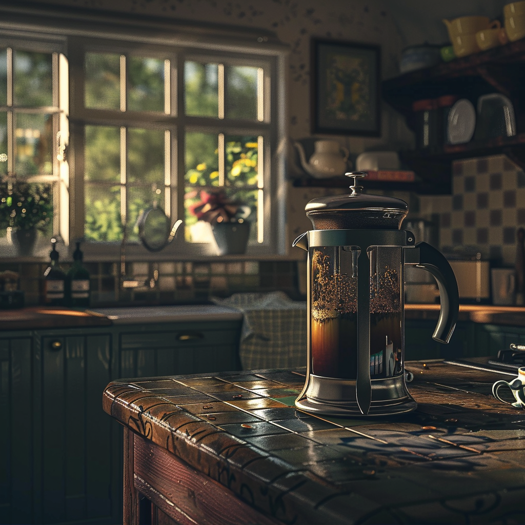
[Image Description: A photorealistic AI generated image of a French press filled with steaming coffee sitting on the counter of an English traditional style kitchen.]

Before embarking on this residency, I have been thinking a lot about the idea of ‘process.’

During lockdown, repeat processes and set routines kept me grounded. I particularly think back to buying a coffee machine. You know, the ones where you buy the fancy-looking pods, pop them in the machine, press a button and watch your espresso be poured for you at the perfect temperature. There was something so unappealing about this. I was craving a deeper connection between the process and output of my morning coffee.

Now, in 2024, the coffee machine gathers dust while I use a simple French press instead. I enjoy grounding the beans to my liking, scooping the grounds into the press, filling it up with hot water, waiting a while, pushing the plunger down and finally pouring my coffee into a mug.

Perhaps this all sounds silly, but I learned a lot from reintroducing ‘process’ into my coffee routine. It’s for this reason that I’ve previously been a bit apprehensive about using artificial intelligence in my creative practice. The idea of it felt like I was once again removing the process of making art.

Now on this residency, I feel quite differently. I’m excited to explore the ways I can use AI within my process. I predict that I’ll use AI during the research and the early visualisation stages of my projects and then take that inspiration into the 3D production work that I’ve been developing over the last few months. However, I’m also happy for any of these predictions to change.

Anyway, the initial image on this post is one of my first attempts at using Midjourney, a generative AI tool. It did a really good job, but there are a few mistakes if you look more closely. The actual plunger used to press the coffee grounds to the bottom is nowhere to be seen. Also, you can see quite a lot of liquid coffee at the top. These mistakes are really exciting because it means it is my job as an artist to figure out solutions to these errors..or even exploit the errors for creative purposes.

[Image Description: A photorealistic AI generated image of a Black woman with dreadlocks pouring coffee from the French press into her cup in front of an old kitchen table.]

The next image I have included here is me trying to recreate my mornings with my French press using Midjourney. This is the prompt I used to generate the image:

a photorealistic image of a Black woman with dreadlocks pouring coffee from a French press into a mug in a traditional British kitchen

What I notice in these images (and the many others I tried to create) is that the algorithms do not understand how we as humans pour coffee from French presses into mugs. In the above photo, the person is pouring from a French press into a mug from a strange angle. They also hold a random unidentified object in their other hand. I tried to fix the issue with further prompts, but I think it will take more time for me to get it right.

The last thing I’ll add is that the image descriptions used in this post were supported by AI, but I’ll go into more detail on that in another post.

This is all part of the fun and I’m excited to see what will come of these AI experiments.

Unleashing Creativity with Generative AI

Session 1: Understanding GenAI Tools

  • Part 1: Introduction to GenAI for Artists
    • Overview of GenAI
    • Applications in the art world
  • Part 2: Hands-On Practice with Idea Generation Tools
    • Using ChatGPT for brainstorming
    • Exploring AI-based idea generation tools (e.g., DALL-E, DeepArt)

Tools

Next: Concept Development and Mood Board Creation

GenAI: A First Step

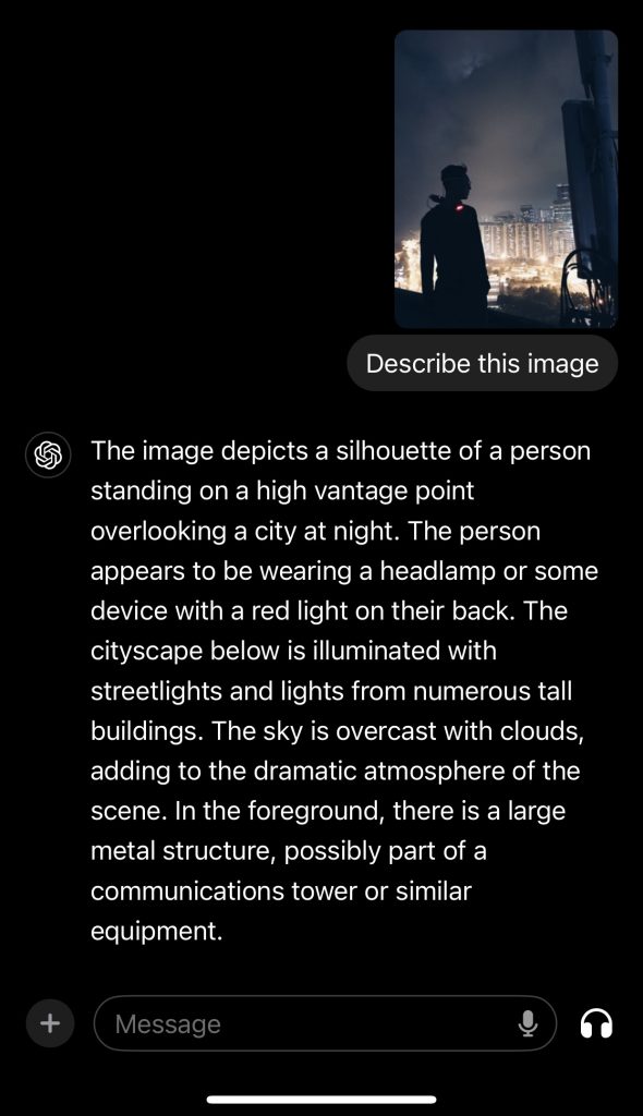
As part of my residency with Vital Capacities, I’m exploring the relationship between GenAI and artists, focusing on how AI can enhance our creative processes. Today, I’m excited to share my first use case: using ChatGPT to extract and describe image content for accessibility purposes. Here’s a photograph I captured during my urban exploration.


To ensure that my work is accessible to all, I used ChatGPT to generate a detailed description of the image. The AI accurately identified the silhouette of a person standing on a high vantage point, overlooking a brightly lit cityscape at night, with an overcast sky adding to the dramatic atmosphere.

A screen capture of James requests ChatGPT to describe his portfolio picture. ChatGPT response the image description

This initial use of GenAI demonstrates how artists can utilize AI tools to create accessible content, ensuring that our work can be experienced by a broader audience, including those with visual impairments. By integrating AI into our practice, we can enhance the inclusivity and reach of our art.

Stay tuned as I continue to explore and share more ways in which AI can support and transform our artistic endeavors. This is just the beginning of an exciting journey with Vital Capacities.

Anima Sola, or, Prayer For A Lost Soul

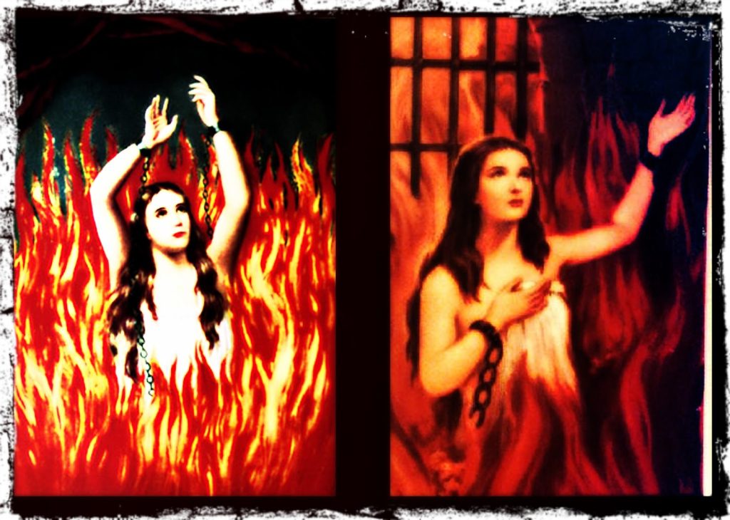
Two images side by side of the Anima Sola, which translates as Lonely Soul. They are both variations of the same image depicting a white woman with long black hair flowing over her shoulders, with her hands in shackles attached to chains. These chains descend into roaring flames that surround her body, concealing the lower half of her body. Her arms are reaching upwards, in a gesture of someone asking for help.

“Anima Sola, also known as the “Lone Soul” prayer, is a Catholic prayer that is recited after an individual has died. However, it can be said for someone who is facing major life changes. According to tradition, this prayer was recited by a monk named Gregory of Sinai in an isolated monastery in the eleventh century. Animas Solas became a common prayer in many countries during the 15th century:

O Lord, I am so lonely and despaired.

I cry out for your help.

My soul is empty and restless.

Fill it with your glory, O Lord!

Anima Sola

Alone, I am lonely. Alone, I feel lost and afraid. Alone, I have no one to talk to. Alone, people do not understand me. Alone, there is no one to listen to my troubles and worries.

God, please help me find someone who will be my friend and companion for life!

Anima sola, anima Christi,

per quam tibi nos reconciliamur.

O Maria, Mater Dei et hominum,

terribilis ut castrorum acies ordinata,

tu ades cunctis in periculis nostris.

Oh God,

I am alone in this world.

It is you I must rely on, and only you.

Oh Lord, I call to you for help.

Alone I am,

and yet not alone.

I am surrounded by a thousand angels,

who wait for me to join them in the Kingdom of Heaven.

I wait for them as well.”

I came across the phrase Anima Sola through a recent edition of Phoebe Hildegard‘s newsletter (if ur into TTRPG’s, necromancy and Spiritualism, it’s VERY good, big recommend). I find the Anima Sola prayer super interesting. Firstly, as a tradition borne of the living working on behalf of the dead, (and specifically the ‘dead in need‘ too, something a lot of contemporary necromantic traditions generally shy away from) I find it to be, honestly, very moving. Secondly, it’s an unusual prayer in the sense that it puts the person intoning it into the shoes of the ‘lost soul’; to say the prayer is to experience their destitution as if it is ur own. On the one hand, this obviously makes it a potent prayer for those who’s experience of loneliness and despair does align with that of the anima sola. But also, it could in turn be a kind of declaration of care, and potentially even of friendship: as those performing the prayer could even be saying, “friend, let me take that load off you for a minute, I’ll help u carry ur burden”.

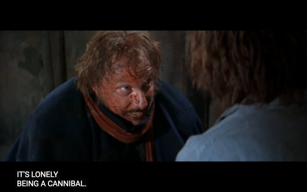
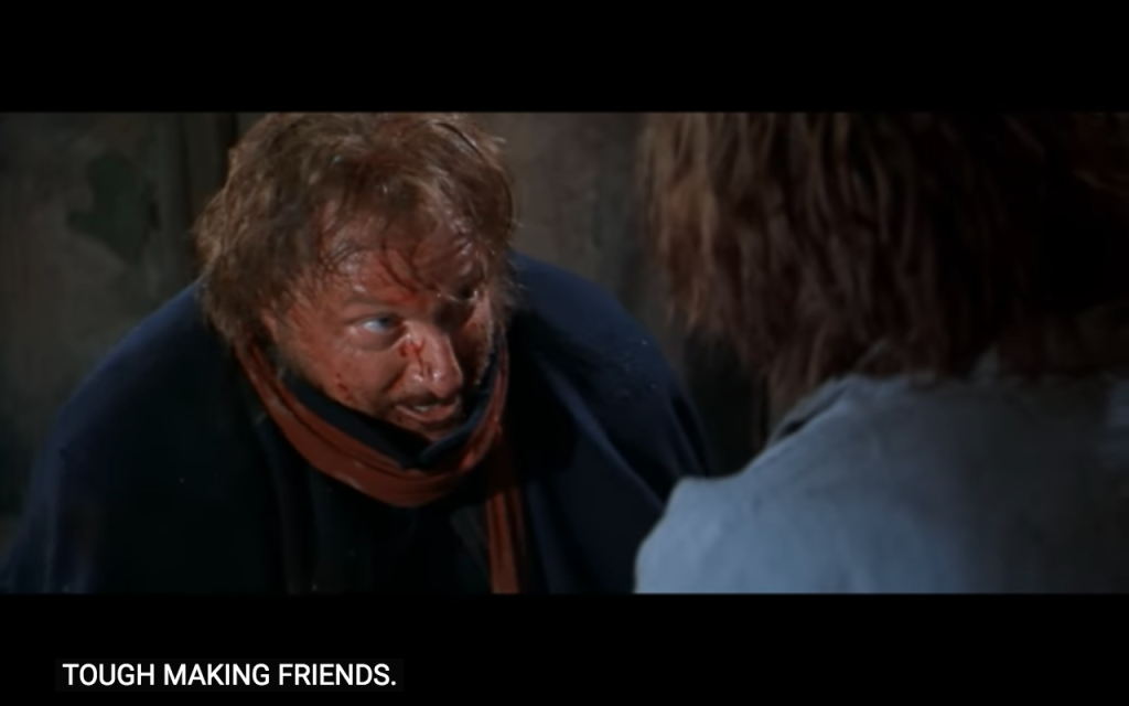
Stills from the film ‘Ravenous’ (1999)

A scraggily looking white man with short but curly brown hair and an unkempt brown beard is cowering against the side of a tent looking frightened. Beneath him are subtitles that read: "he was - he was licking me."
A medium-shot image of an unkempt white man with ginger hair and beard, looking very muddy and spotted with blood, with bulging eyes look up towards a character slightly out of shot, over whose shoulder we see the ginger haired man. Below this are subtitles that read: "it's lonely being a cannibal"
A medium-shot image of an unkempt white man with ginger hair and beard, looking very muddy and spotted with blood, with bulging eyes look up towards a character slightly out of shot, over whose shoulder we see the ginger haired man. Below this are subtitles that read: "tough making friends"
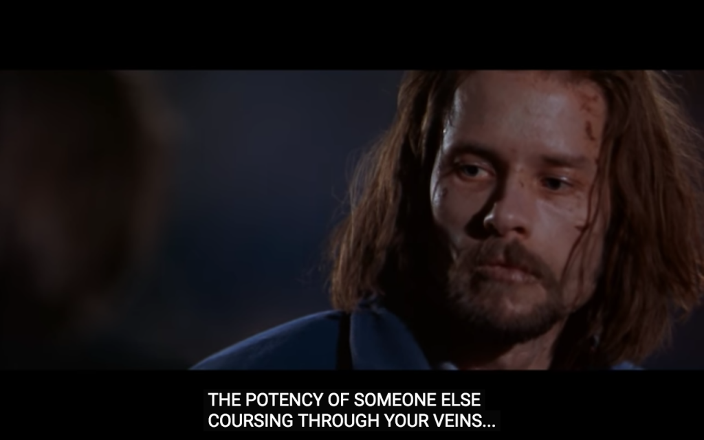
A close up of the face of a gaunt white man, with shoulder length brown hair and a beard, looking very unwell and pale, with cuts and blood on his face and very dry lips. The man looks off in the distance despondently. Below this are subtitles that read: "the potency of someone else coursing through your veins"

I came down with a cold over the last two days and so lay in bed eating soup and crisps and watching films. Two of the films I watched were Anthony Hopkins Hannibal vehicles (Red Dragon, and Hannibal), and both were pretty bad (admittedly, Red Dragon was the least bad of the two), and really showed up how Anthony Hopkins Hannibal is like a one-dimensional cartoon character, in comparison to the genuinely terrifying black hole of Mads Mikkelsen’s iteration.

Anyway, the other film I watched, continuing the cannibal vibes, was the 1999 Ravenous, directed by Antonia Bird, written by Ted Griffin, and starring Guy Pearce and Robert Carlyle. I’d never heard of it until I listened to this podcast episode with Sasha Ravitch. The film is utterly bonkers, in a very enjoyable way, and has lots of overlaps with the classic vampire story cliche of turning people into vampires so you have someone who can actually relate to you, the desire to be seen and understood in your monstrosity, not shamed or shunned for it. It also brings in the First Nations, Great Planes, and Great Lakes indigenous folklore of the Wendigo:

“The wendigo is often said to be a malevolent spirit, sometimes depicted as a creature with human-like characteristics, which possesses human beings. The wendigo is said to invoke feelings of insatiable greed/hunger, the desire to cannibalize other humans, and the propensity to commit murder in those that fall under its influence”

Ravenous places this mythical creature as a blunt metaphor for the USA’s imperialist/colonialist expansion and consumption of people, land and resources, whilst offering an assortment of temporary boons and power to those who will exercise the nation-state’s will on it’s behalf (which in the film make the characters rapidly heal from potentially mortal wounds, and give them what Carlyle’s character repeatedly refers to as ‘VIRILITY’).

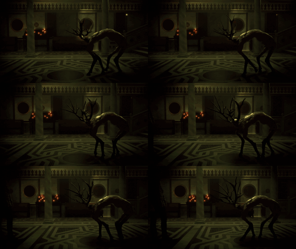
Interestingly, in the Wikipedia entry for Wendigo, Hannibal the TV show pops up again, as this is what Will Grahams hallucination throughout the series is in reference to:

An animated gif of a the inside of a dark and gloomy catholic church. Candle offerings are burning in the background. The floor is a beautiful mosaic. A strange creature moves awkwardly forwards. It seems to have deer legs and deer antlers, but no head, and possibly the body of a humanoid with their back arched

Collated research on the OKO system

OKO is the early warning system

The type of satellite is Upravlyaemy Sputnik Kontinentalny, or US-K.

These form the Kosmos system (which I have also seen spelt Cosmos).

‘The satellites are drum-shaped, 2 metres long with a diameter of 1.7 m. They weigh 1,250 kilograms without fuel and 2,400 kilograms when fully loaded. They have a 350 kg infrared telescope pointing toward Earth, with a 4 m conical sunshield and an instrument bus. The telescope, which is the satellites’ main instrument, is able to detect radiation from ascending missiles.’

Kosmos has a total of 101 satellites launched between 1972 and 2012, according to Wiki.

The last US-K satellite (Kosmos 2469) was launched on 30 September 2010. As of December 2015, the entire OKO programme is being replaced by the new EKS (or Tundra) satellites and the Kupol system.‘Reportedly the Tundra satellites carry also a secure emergency communications payload to be used in case of a nuclear war.’ I think there are six in orbit, with another launching this year. https://space.skyrocket.de/doc_sdat/tundra.htm

The satellites rely on infrared sensors that can directly detect radiation emitted by a missile plume.

An over-the-horizon (OTH) radar, like all radars, detects reflections of electromagnetic signal that it sends in the direction of a target. OTH radars deployed on the Soviet territory were able to detect missile launches on the territory of the United States by using reflections of electromagnetic impulses from Earth’s ionosphere.

The system began limited operations in 1978 and was placed on combat duty in 1982 (so it was very new when the 1983 incident occurred).

The bunker in Serpukhov-15 includes antennas to communicate with the satellites.

Launches of early-warning satellites into highly elliptical orbits are performed by Molniya-M launchers from the Plesetsk launch site in northern Russia.

An amazing website for tracking satellites http://www.satflare.com/home.asp

The full list of satellites in the Kosmos system https://space.skyrocket.de/doc_sdat/us-k.htm

Related artworks: The Time Before The Fire by Nye Thompson

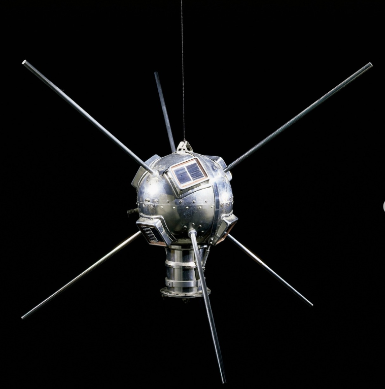
Vanguard 1, the oldest artificial satellite still in orbit around the Earth
Vanguard 1, the oldest artificial satellite still in orbit around the Earth. Source link below.

Nye Thompson has begun some new research around satellites, especially decommissioned ones, for an online residency with Mostyn Gallery.

This is the summary:

Far above, over our heads a hidden choreography of national and commercial power struggles is playing out. Military, communications, GPS, imaging, monitoring, surveillance – satellites live fast and hard. Existence maintaining baseline performance in the New Frontier is precarious

Alongside them are the ghosts –  thousands of decommissioned siblings that have outlived their usefulness. They will tumble along their graveyard orbits for years or centuries before they hit the atmosphere and burn.’

Nye kindly pointed me in direction of the Kosmos system of satellites which was used in the OKO early warning system I’m researching!

https://mostyn.org/event/the-time-before-the-fire/

https://www.instagram.com/p/Cg1RaZ2DX-T/?utm_source=ig_web_copy_link

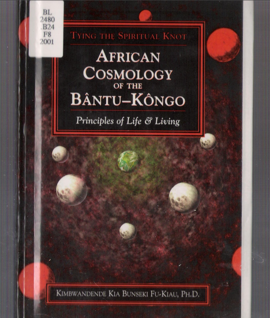
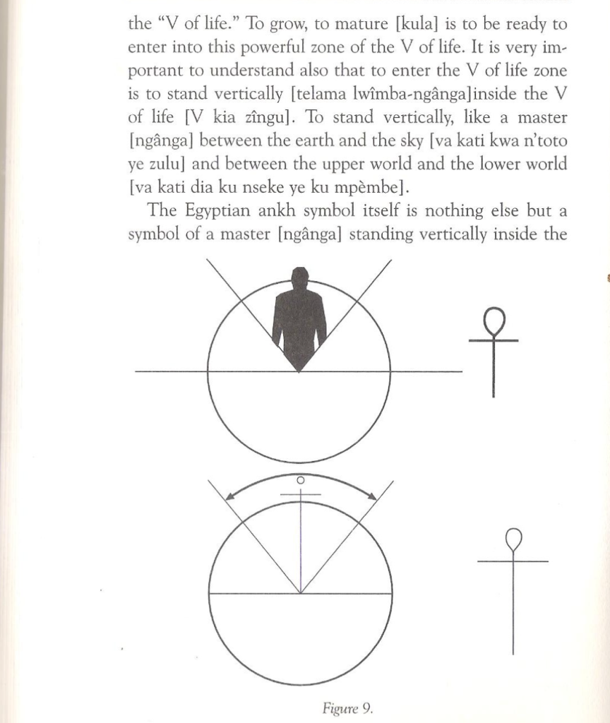
African Cosmology

“Mapping the Universe.”

This chapter had graphs and images to show the Bantu Congo understood the creation of the Universe, the function of rituals for creating balance and how medicines(Nkisi) take care of the human being and its surroundings.

The “V” of life inspired how I could be the manifest and control the planes of existence. With this control, I have the spiritual power to create a universe. This is a universe for a transgender deity and the function of being a vessel for transformation.

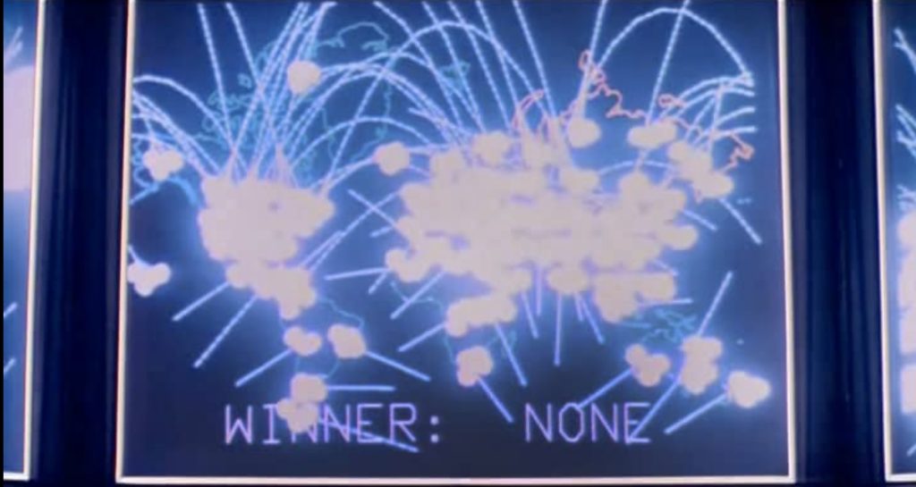
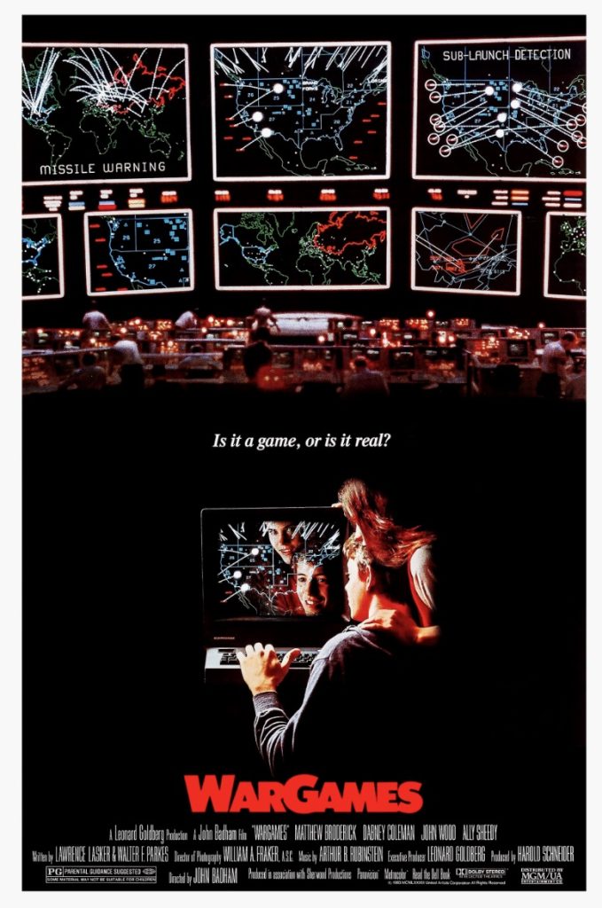
Wargames: the film (1983)

Film still: Wargames, film (1983)

Made in the same year as the Serpukhov-15 incident, Wargames was a film that speculated on the beginnings of accidental war, automated weapons and hackable military facilities.  The plot focuses on a high school teenager who discovers a backdoor into the computer that controls America’s nuclear weapons. Thinking it can’t possibly be a real military computer, the teenager at first thinks he’s playing a computer game, unable to comprehend the enormity of global violence now at his fingertips.

The computer itself was designed to replace human workers (those in power don’t want moral judgements and ethics to stand in the way) so it begins to play the ‘game’ back. And once it starts, it won’t stop.

The film’s tagline is ‘the only winning move is not to play’. Against the background of my research interests, it’s reminding me of something I read in Carissa Veliz’s book Privacy is Power: ‘the internet does not allow you to remain silent’ (p230). It is incredibly difficult to opt out of systems of surveillance and networks that amass data for ‘algorithms of oppression’, to borrow a phrase from Safiya Umoja Noble.

The technologies of such systems of control rely on our inputs, which is why the issue of choice is so pertinent.

In the film, choice was looked at through the lens of computer automated weaponry.

Finally, in Wargames, to stop the computer and to avert catastrophic destruction, they have to convince it that continuation is futile. The competitive cycle of input and response must stop. There are no winners in nuclear war.

I’m wondering what I can take away from this in relation to my research. Maybe it’s that there are no winners when huge amounts of the population are criminalised, subjected to limited opportunities, and marginalised and discriminated against by opaque computerised processes.

Gillian Wise, Russian Constructivism & Gants Hill station

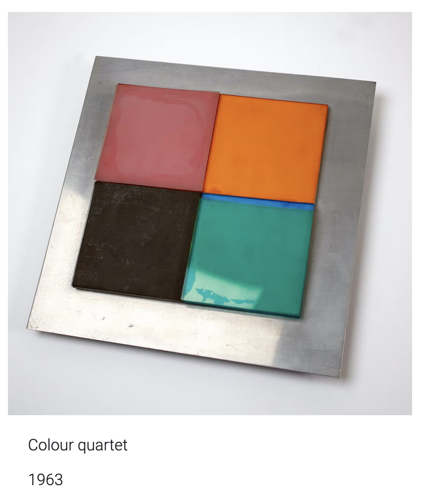
This is an image of an artwork called Colour Quarter by Gillian Wise produced in 1963. It is a square metal piece with four smaller coloured squares within in. A soft red, a brown-black, an almost turquoise green and an orange. The work has an industrial feel mixed with a playful style.

I am currently researching into artists from Ilford. (Ilford is one answer to where I’m from)

Gillian Wise was a British visual artist born in Ilford. She was part of the English Constructivist movement of the 1950s before becoming a key member of the Systems group.

“Her work follows the principles of experimentation and reduction to elemental units (line, colour, and plane). Her structures play on the effects of the geometry of light and industrial materials, as well as contrasts between transparency and the primary colours.” – aware

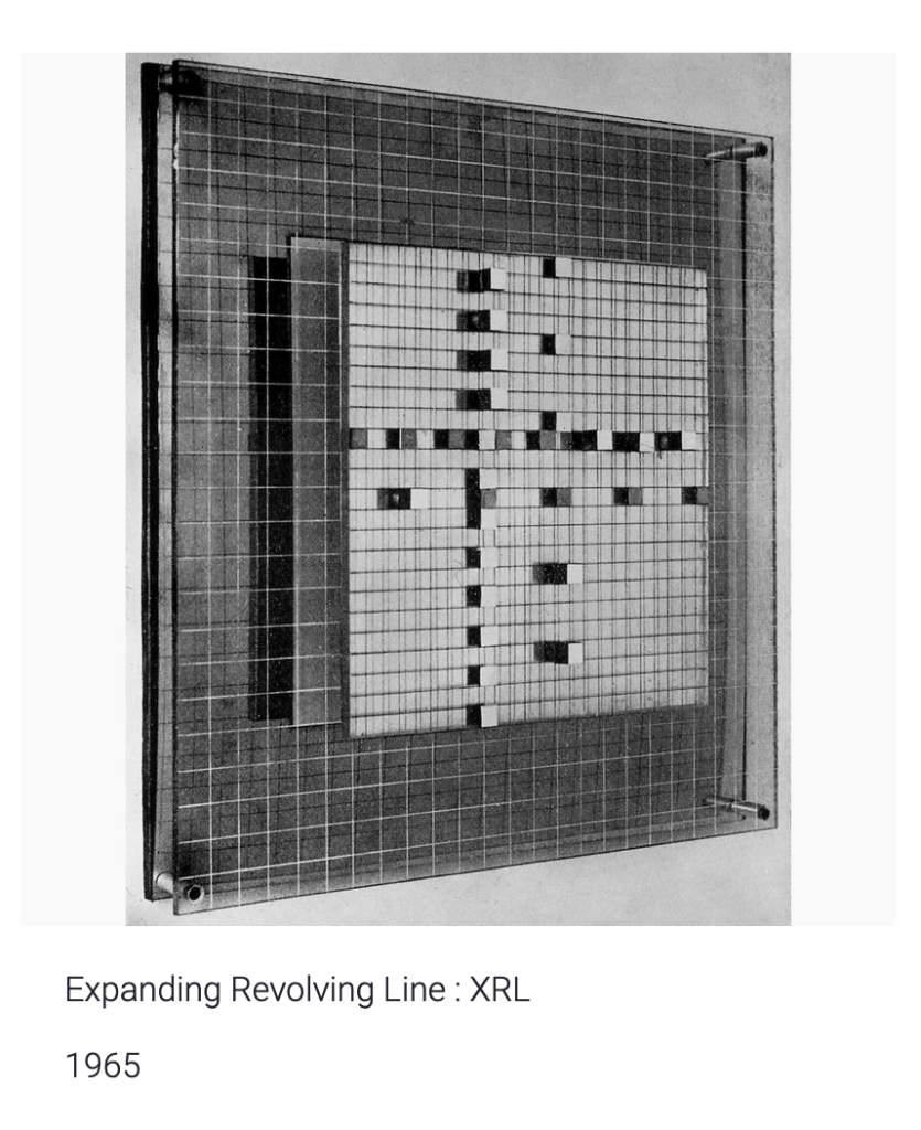
This is a black and white image of an artwork by Gillian Wise called Expanding Revolving Line: XRL produced in 1965. It shows two large rectangular pieces, laid over each other with a few centimeters between. The outer is a glass grid that further holds a square metal sheet. Within the square metal sheet, smaller metal squares are lifted onto the surface giving the work a three-dimensional quality. The work is stark and simple, seeming at times like a game but potentially also like a map.


Gillian Wise was born in Ilford in 1936. She grew up in Ilford until leaving the area to study at 18 in Wimbledon. She exhibited as part of the British constructivists and became their youngest member in 1961. She challenged the predominance of American modernism at the time and then continuously throughout her career. She clearly understood art and artistic production to be an overtly political matter and spoke often about the CIA intervention in Cold War cultural production.

From her book, Low Frequency:

“There artists of all stripes and their nascent agents had to be American to get the full treatment of nurture and sponsorship since that is what policy demanded. Policy from Washington. Out of this was born the Abstract Expressionist group… the two names which have been retained as most representing that moment are Pollock and Rothko, although the latter was trying for a stylistic variant. While Pollock reflects some early Alexander Rodchenko (one of the original and prolific members of the Russian Constructivist movement) experiments, Rothko’s attempt at mysticism, à la Malevich, is a very thin affair.”

Her work was overtly political and she herself was an avowed Leftist who won a British Council scholarship to research Russian constructivism in 1969. She travelled to Leningrad, exhibited in Helsinki and joined the Systems group, a collection of Marxist artists who successfully produced and showed work throughout the 70s.

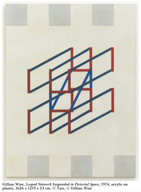
This is an image of a work by Gillian Wise called Looped Network Suspended in Pictorial Space from 1974. It is acrylic on plastic and contains a central geometric form made of blue red and green lines on a creme background. It gives the impression of string and the sense of flexibility despite all of the lines being perfectly angular.
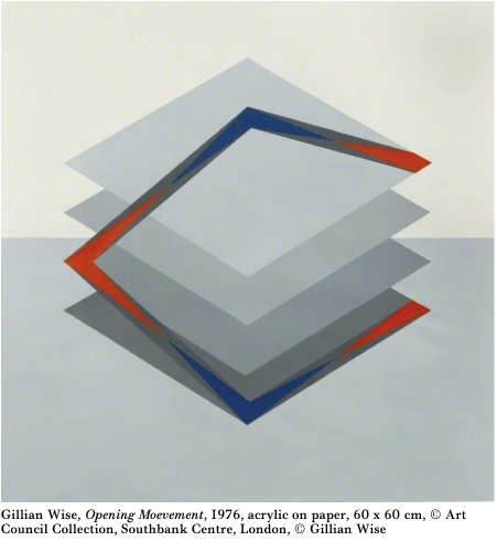
This is an image of the work Opening Movement by Gillian Wise produced in 1976. It is a painting on paper with acrylic. The background of the image is split horizontally with the lower half painted grey and the upper half creme. In the foreground is an abstract image made of four tilted grey squares descending downward. Connecting them at an odd angle is a blue and red frame. It is as if the simple framed square is springing upward off of its flat back.


Gillian Wise was the only British artist to create work for the opening of the Barbican centre in 1982. Her work, the Alice Walls, inspired by the Russian avant-garde, remained entirely uncredited until 2014. She referenced it as, “a dark episode in the annals of support for national artists and, of course, women.”

The history of this Ilford-born artist gives so much rich context to the sidelining of genuinely Leftist and Marxist positions throughout the Cold War. It also references the definite and unacceptable misogyny of the mainstream British art establishment who have since begun to rewrite their silence around Gillian Wise with her inclusion in a variety of shows.

While on the surface it seems that Ilford plays a limited or invisible role in the artists history, one striking historical coincidence keeps me wondering.

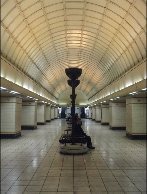
This is an image of Gants Hill train station showing the central concourse. It shows a creme-coloured vaulted ceiling with a row of benches through the middle where some commuters are sitting. At the end of the shot, small but visible in the distance are the escalators going upward. The station is lit by a row of tall upturned lamps across the cental line of benches. The photograph is beautifully symmetrical, except for the commuters who predominantly face the platform leading into central London.
Gants Hill Underground Station in Ilford


In 1937, one year after Gillian Wise was born, construction on the Gants Hill underground station in Ilford began. The station was designed by Charles Holden and was inspired by stations on the Moscow Metro.

Before it was eventually opened to the public in 1947, the ‘under construction’ station was used as an air-raid shelter. After consultation between Moscow and London about the building of the Moscow Metro in the 1930s, British architects returned to London with some new ideas. Gants Hill is designed with a central vaulted concourse separating two platforms in order to maximise the amount of space for the flow of people.

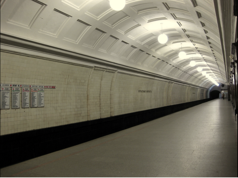
Getting to the platform level of the station is a striking experience. As you travel down the deeply-set downward steps the square floor tiles slowly come into view before the marvel of the ceiling is revealed. The station has barrel-vaulted ceilings and is tiled in a geometric pattern that is reminiscent of the Krasnye Vorota Metro station in Moscow which opened in 1935.

This image is a photograph of Krasnye Vorota Metro Station. It shows a creme-coloured vaulted ceiling with tiled walls. It bears a striking similarity to Gants Hill station in London. In a small difference between the two, this image shows orb-like lights hang from the ceiling. The platform is empty of people and the angle of the photograph emphasizes how barrel-shaped the station design is.
Krasnye Vorota Metro Station


Ivan Fomin was the designer of the Krasnye Vorota Metro Station. Fomin worked in a variety of styles throughout his lifetime, including Art Nouveau, Neoclassicism and an intermediary style of architecture known as Postconstructivism.

By the early 1930s, Constructivist art and architecture had fallen out of favour and was soon to be replaced. Stalinist architecture would become the dominant form of expression for the next decades. Wedged in between these two larger forms is a brief architectural style known as Postconstructivism (sometimes referred to as early Stalinism).

Constructivist work had been wildly imaginative and avant-garde in its use of shapes, materials and technology. It was avowedly political, aiming to incite a social purpose for all people in public spaces. The demise of Constructivism comes alongside the rise of Stalin and the impact of centralised state power. The Stalinist architecture that followed utilized classical forms representing a return to traditional notions of power. Dmitry Khmelnitsky writing about this period suggested that Constructivism was ended by the force of Stalinist power. Khmelnitsky suggests that “traces of the Constructivist style in the Postconstructivism of the 1930s are a sign of indecision, not tradition.” There was a vacuum that state-sponsored artists were filling with a combination of what came before (Constructvisim) and even further back (Classicicism). This combination of ideas was the starting point for Stalinist architecture. Postconstructivism is truly then a misnomer for the return of classicist forms and styles with accidental traces of Constructivism.

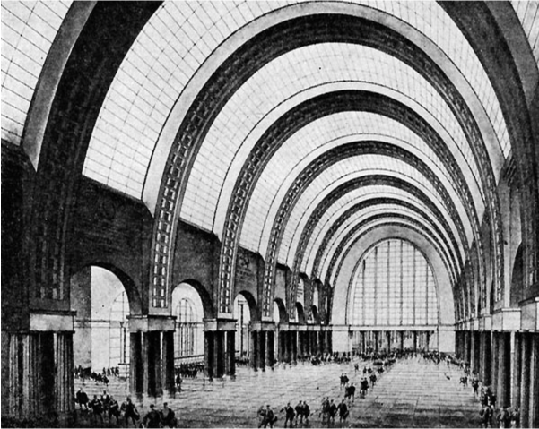
Ivan Fomin himself had a deep love for classicism and had spent a long time attempting to develop his own form of proletarian classcisim. In the 1930s he partook in key competitions to design the Moscow Metro. He won just one and designed the station Krasnye Vorota with vaulted ceilings and a central concourse. A model of the station was at the 1938 World’s Fair in Paris where it won the Grand Prix. Fomin designed the station in what would become called Postconstructivism.

This is a black and white image of an architects sketch. It shows an exaggerated and large imagination of what a station could be. It shows an enormous vaulted high-ceiling in tiled segments. Each segment meets the ground with a clump of four neo-classic style columns. The sketch shows some people but its main feature is its rounded ceiling.
Ivan Formin competition entry for a Moscow Metro


Gants Hill station in Ilford, designed by Charles Holden adapted from a design by Ivan Fomin, bares the scars of the Constructivist movement being clamped down on by the Stalinist regime.

Gillian Wise, born in Ilford, developed a career as an artist inspired by Russian constructivist art. She would even travel on a British government grant to research Russian constructivism in the country itself.

Only after this trip to Russia does Wise give up being a Constructivist artist and move on to join the Systems group.

I’m not saying that architectural ghosts haunted Gillian Wise as a child until she was able to exorcise them in the country from which they originated but…I am saying that.

Anointed Garments

As a way of communicating and accessing divine vitality, anointed Garments become a token, and their symbolism is vital to the experience of creating rituals. It is not only representation but the surface/platform for the divine to be present within the fabric and in this plane. These garments facilitate becoming a vessel for the creation of a brand new universe.

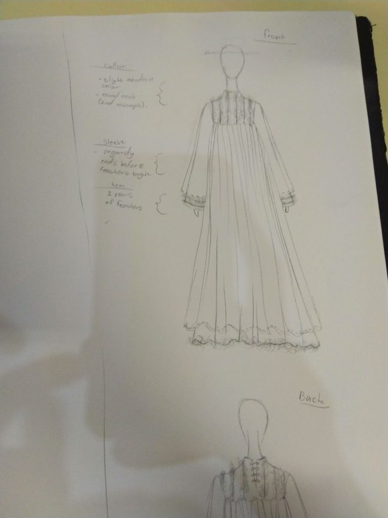
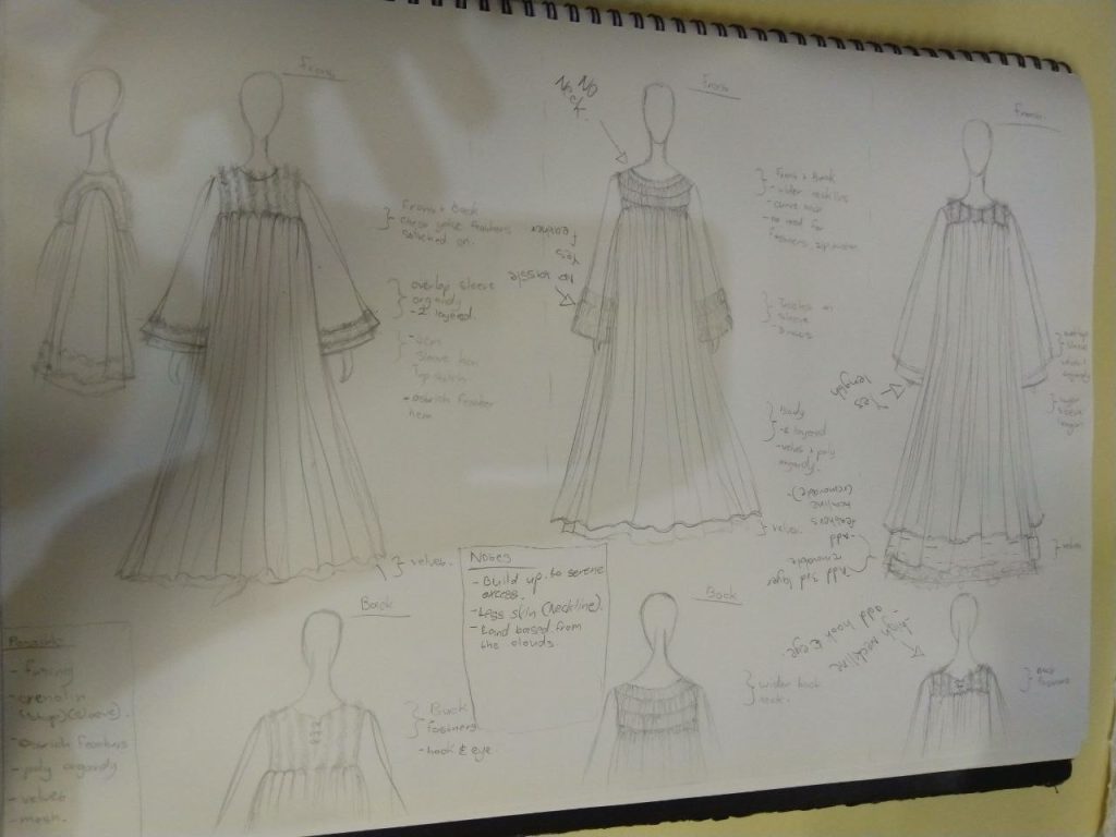
How do I create an anointed garment? Colour is key. Colour communicates various meanings in this process, white is the colour of the garment I am creating. White represents innocence, purity, light and authority. Creating anointed garments requires personal cleansing rituals, prayer/meditation, and the offering of self. As part of this residency, I will become the mediator for a transgender deity, and white is the colour called forth.

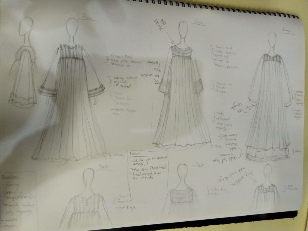
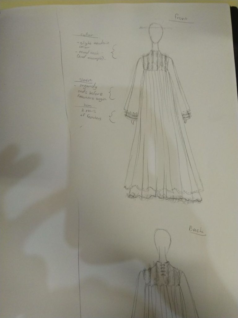
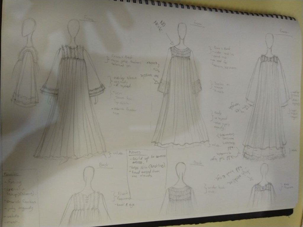
I began the process with a collaborator to design and create a garment for the mediator/vessel here on earth. These are the current sketches of the garment. Upon completion, it will be offered to the deity and prayed for.

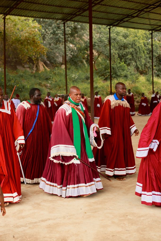
This Valentino show served as a form of inspiration. These Garments are other worldly. I enjoyed watching this show.