

As the work I’m developing moves towards the print stage, it’s time to explain a little more about the risograph process.
My print and printmaking experience started with etching (particularly photo-etching), letterpress, and developed to include screenprinting, and various relief processes, before the transition to digital. Last year, I got the opportunity to develop some work with my friend and collaborator Ruth Jones, who suggested we learn to use the risograph process. This post uses images from developing that work.
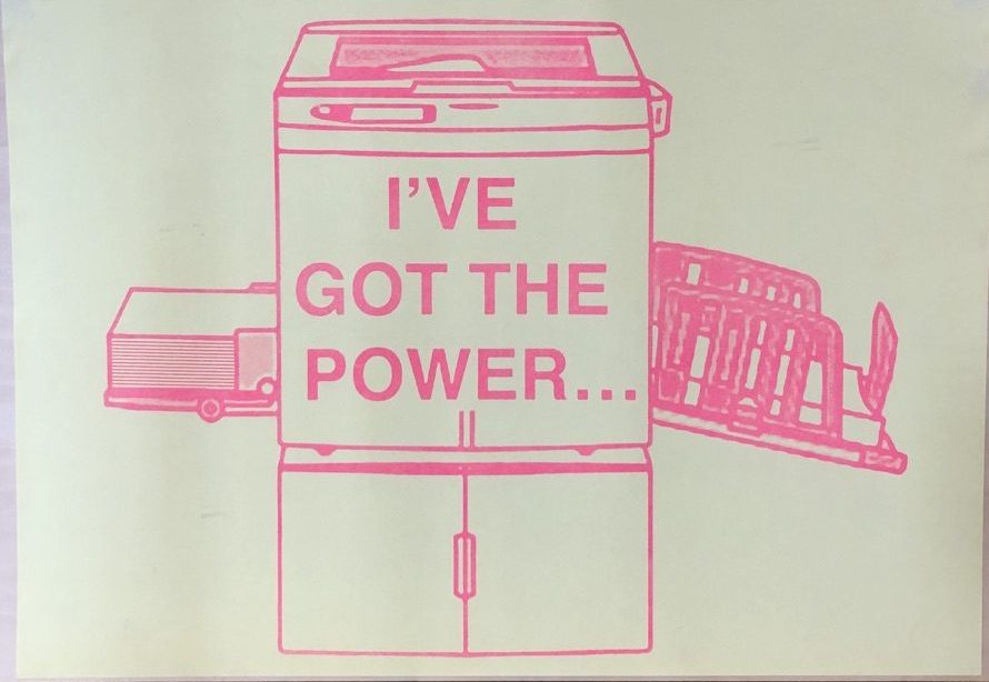
Risograph is sometimes described as a hybrid of photocopying and screenprinting. Like a photocopier, the image you are printing is placed on the glass bed at the top of the machine; paper feeds in from one side and comes out printed on the other. Inside the machine however, the printing process involves creating a type of stencil (referred to as the master). The stencil leaves gaps where the ink is pushed through creating the image. Risographs can also hold two colours of ink and the cartridges can be swapped, so it’s possible to print in one colour, then reload the paper and overprint in a second colour.
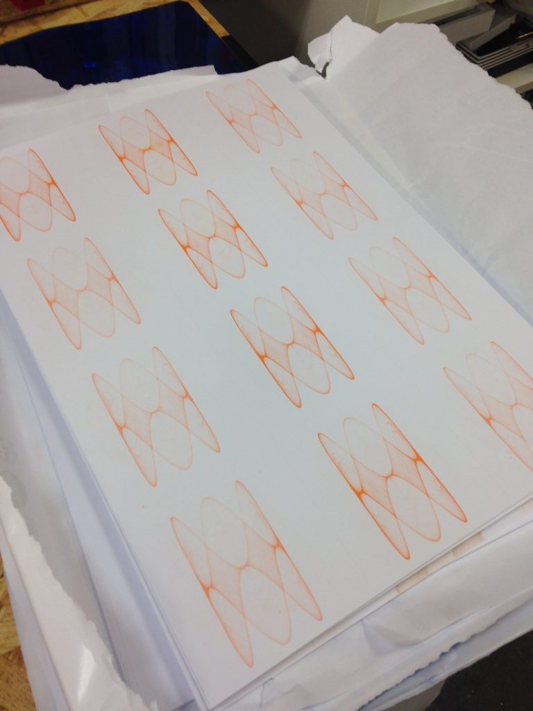
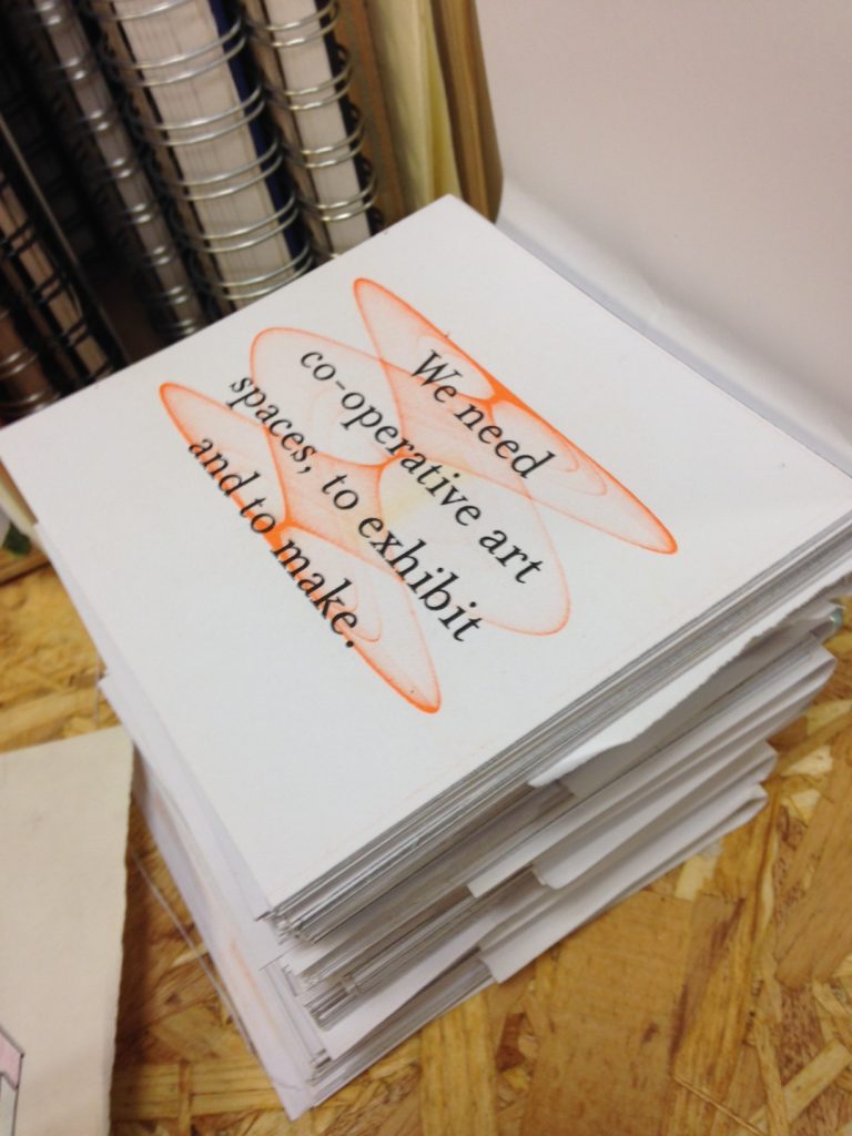
Riso uses soy oil-based ink and is low energy, so has some strong green credentials. Like many print processes, it’s possible to create very simple or much more complex prints, meaning it appeals to a broad range of artists who might create their source imagery in many different ways. Because you’re using limited ink colours, colour mix becomes a bigger part of the creative process – for example, what might be blue in your original image could be printed as pink. The way the stencils and paper feed mechanisms work means that there’s always a degree of variation between prints, something printmakers are used to, but which is avoided in commercial print processes. You also get the sense of the way different machines operate, and the variations – something that printers and printmakers work with.
The machine I will be using at TOW currently contains two colours – black and orange – so I’m developing my imagery with this in mind. What I have to do is create a black and white positive for each colour layer – one that will print out black, and one that will print out orange. Digital techniques can make producing these colour separations a bit easier, but a physical print process will always produce a different outcome to how something looks on a screen. Again, working with these variations becomes part of the creative process.
Using the space safely at the moment means minimising my time in the TOW print space, so I’ll be producing my colour separation positives at home, and I’ll only have short print runs. But I’ve got hold of a really nice paper recommended for riso printing, so am looking forward to some hands-on printing again!